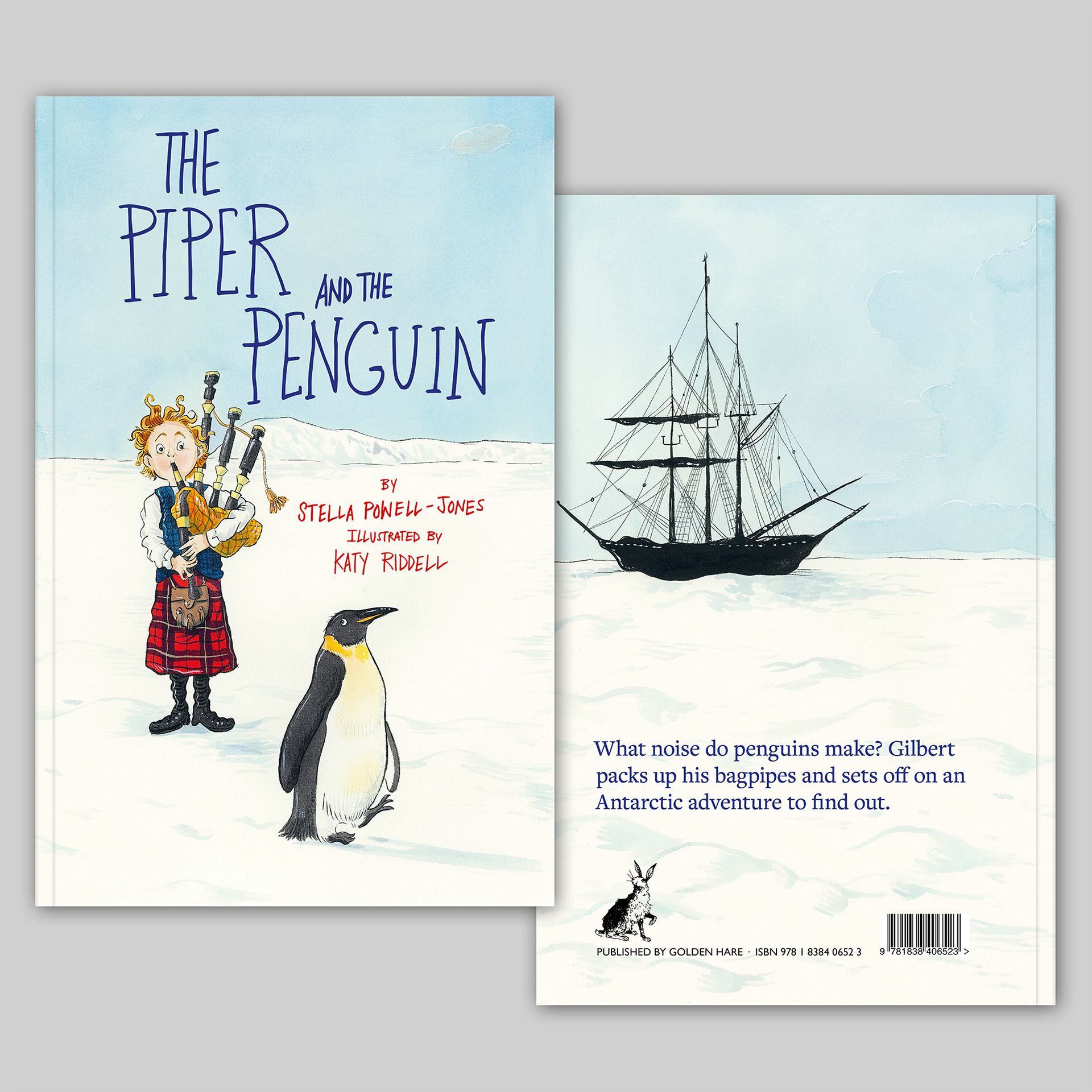
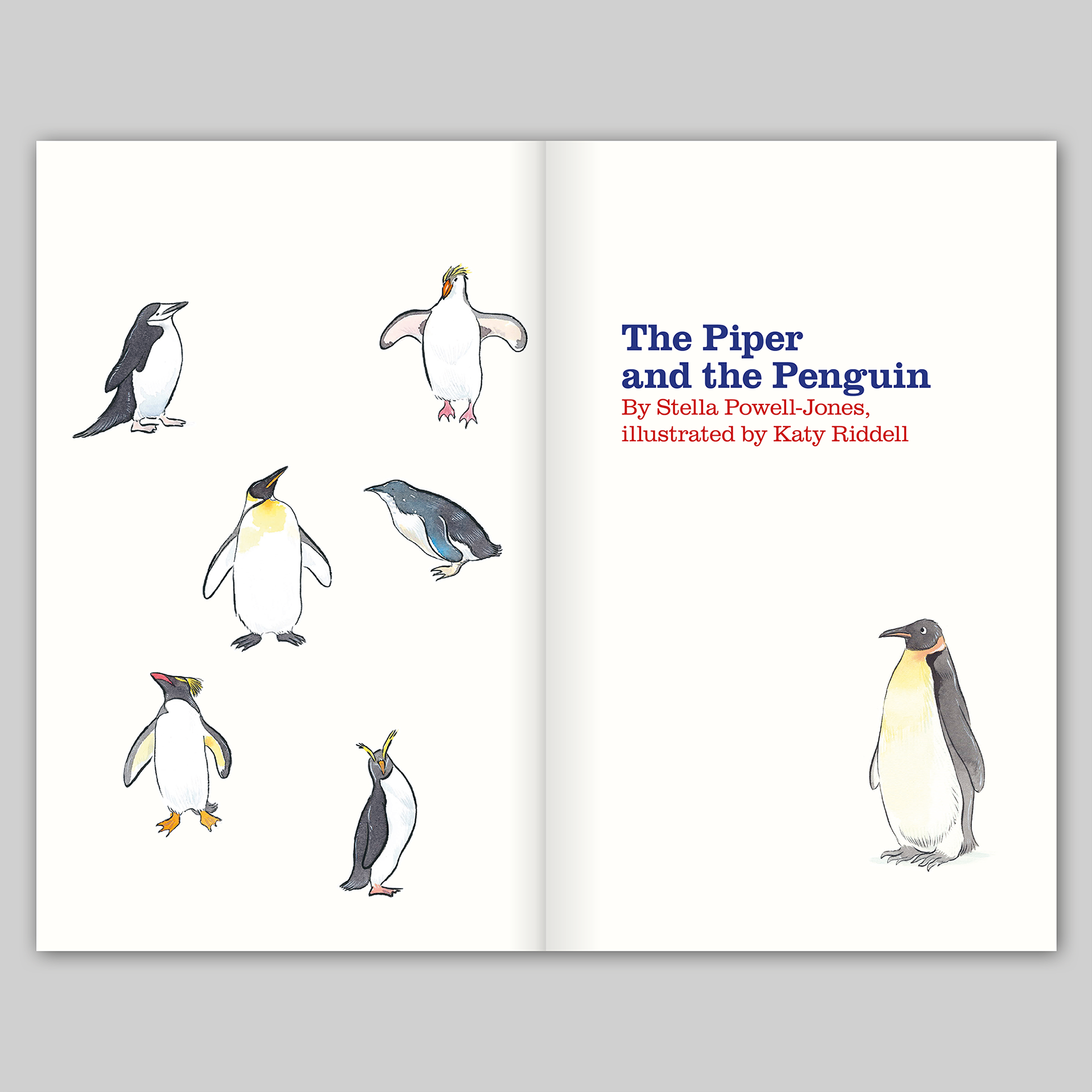
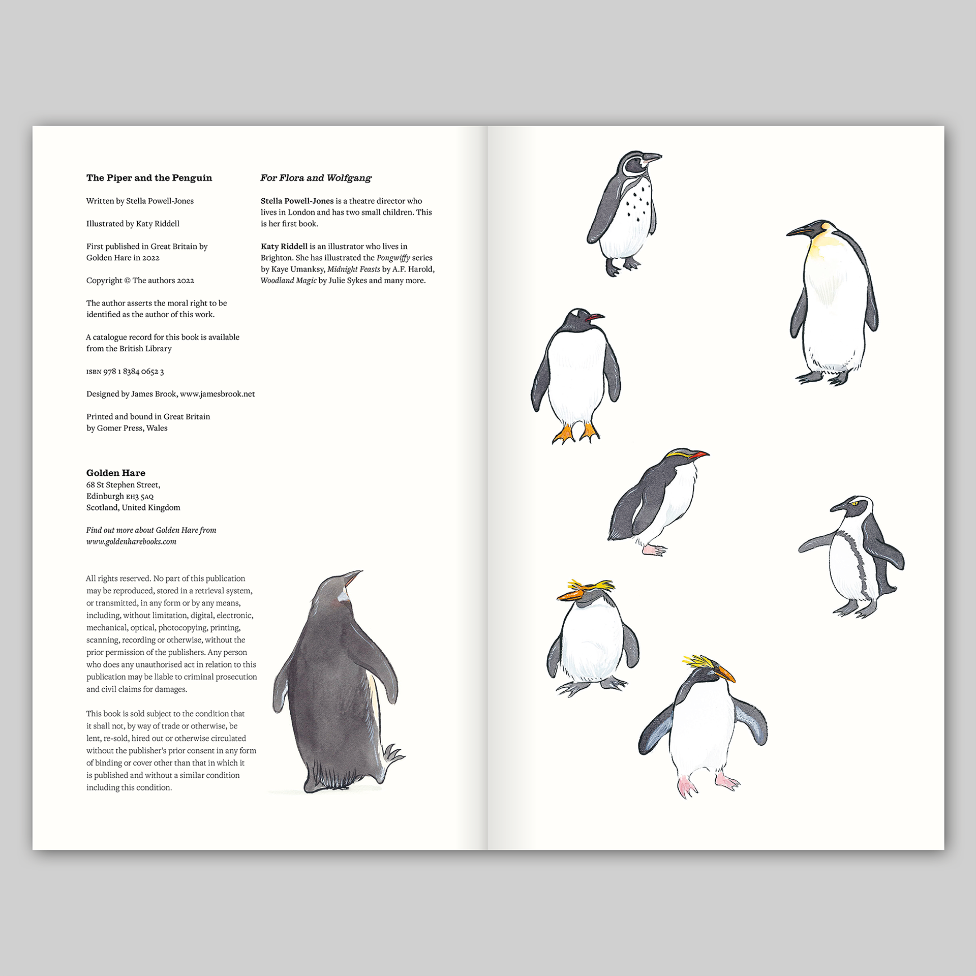
The Piper and the Penguin
Written by Stella Powell-Jones
Illustrated by Katy Riddell
Designed by James Brook
ISBN 978 1 8384 0652 3
270 x 170 mm | 32 pages | Printed by Gomer, Wales, on 170 gsm Edixion Offset with machine-sealed cover printed on 350 gsm Edixion Offset
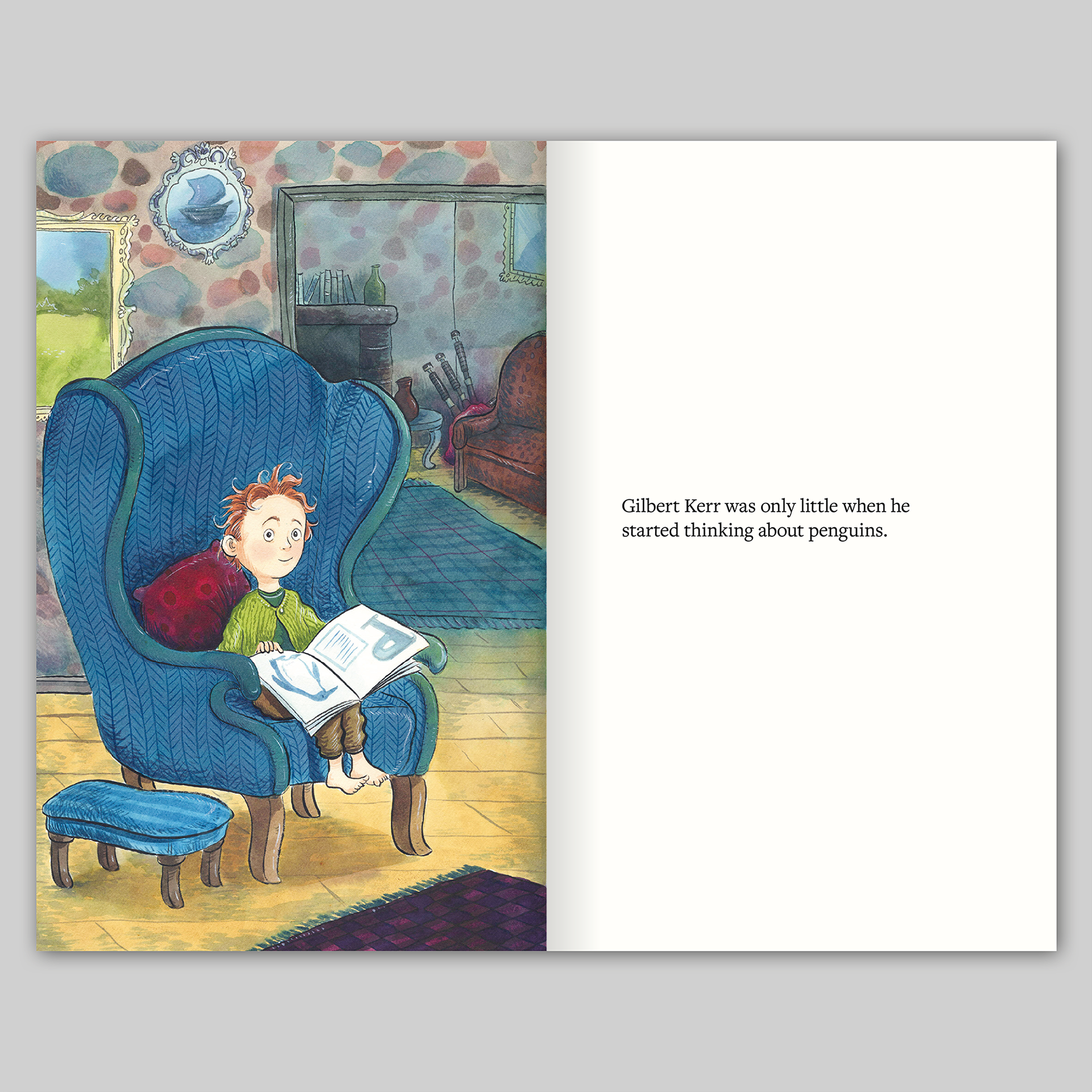
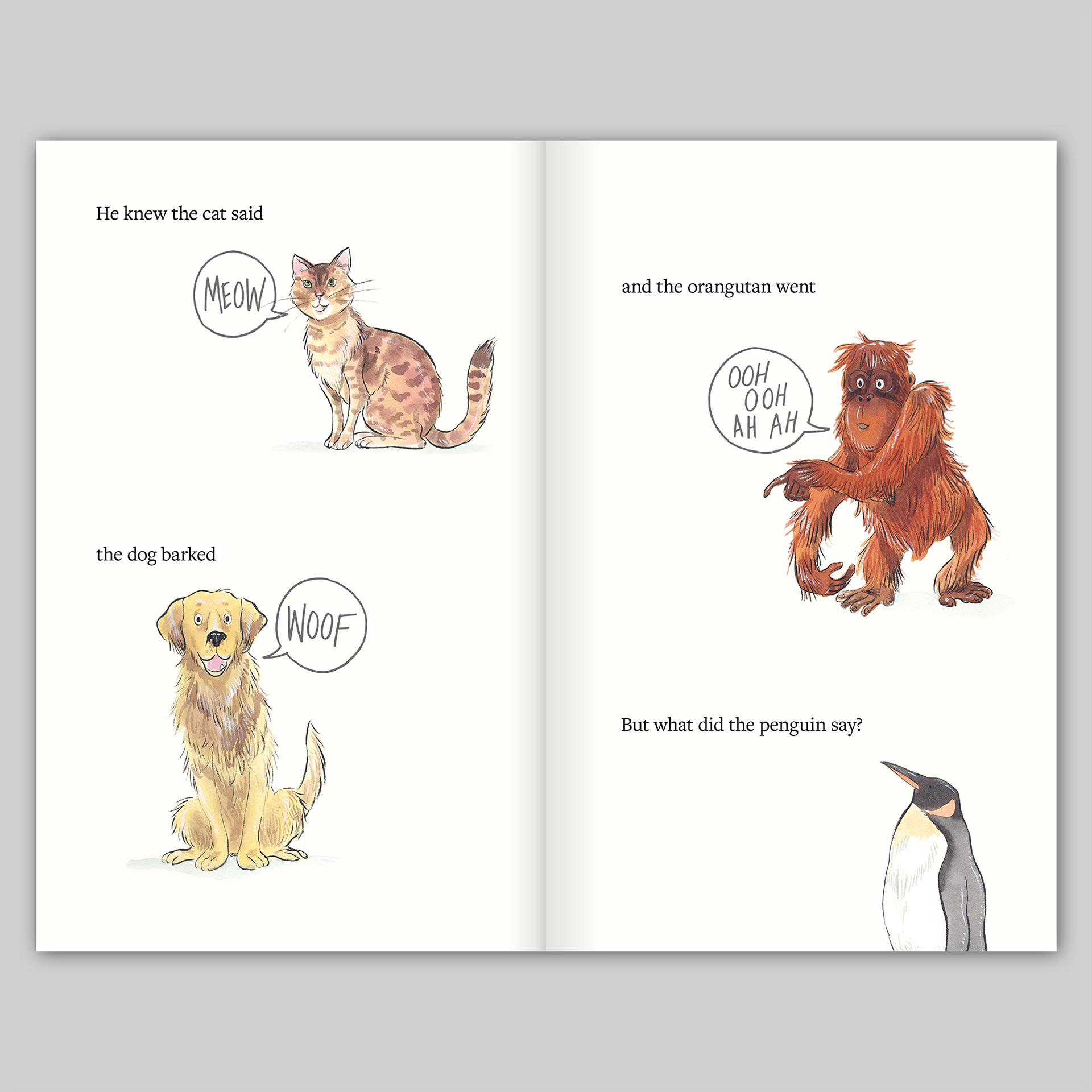
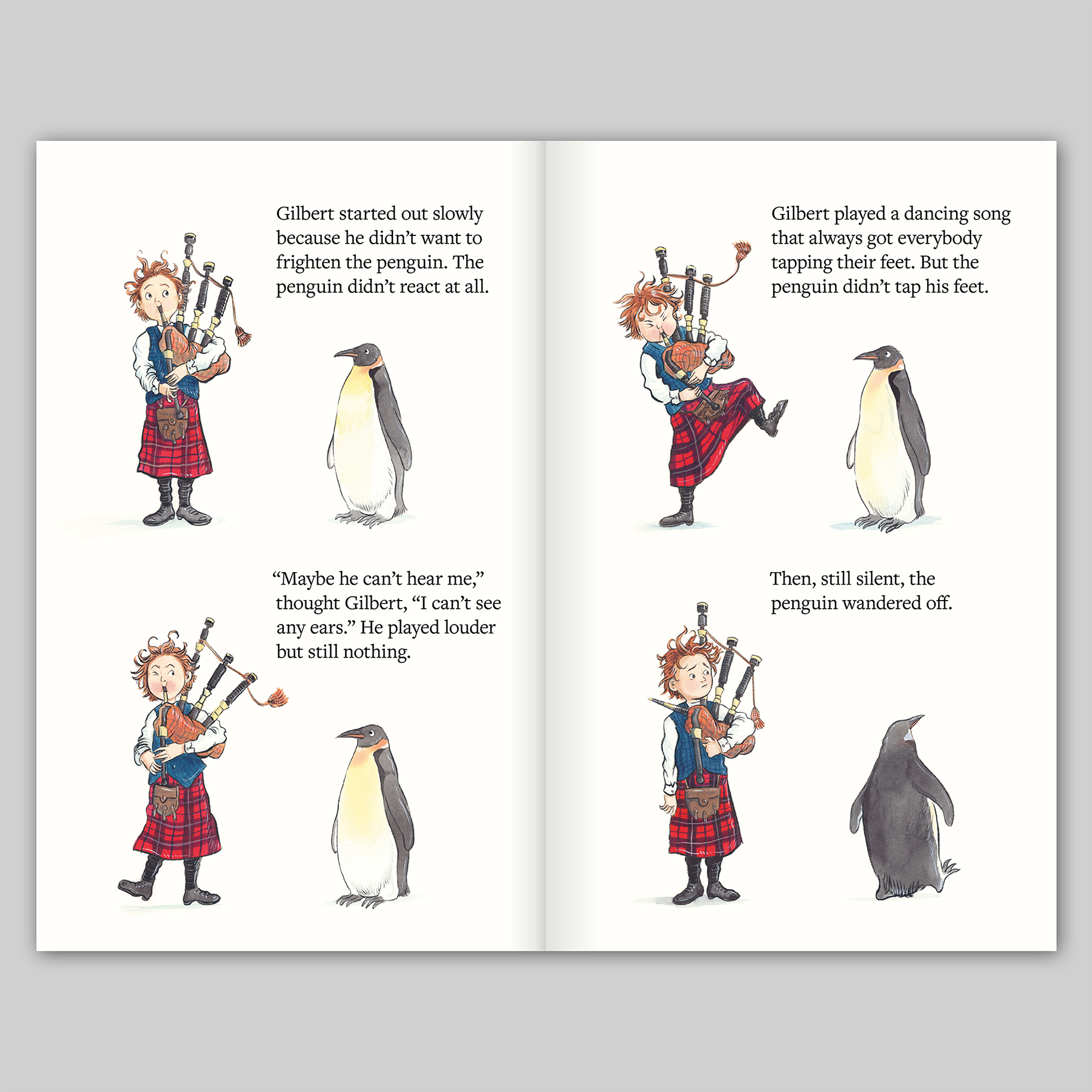
It was delight to work on this children’s book, which tells the story of the young piper Gilbert Kerr’s voyage to the Antarctic to discover the noise that penguins make. The book is written by theatre director Stella Powell-Jones and the illustrations are by the very talented Katy Riddell.
My contribution is largely invisible but it involved the huge task of making the illustrations ready for print, cleaning up and cutting out the backgrounds of the scanned original paintings so that they presented a unified appearance and, of course, typesetting the text. I typeset Stella’s charming story in Freight Text Pro, a typeface that balances the feel of a traditional children’s book typeface with a contemporary edge. I worked very closely with Katy to make sure that her handwritten text overlays felt integrated with her original drawings: I tested many ways of overlaying the text, working with different samples of lettering from Katy and exploring different techniques in Photoshop and Illustrator until I was satisfied with the results.
For the cover, I advised Katy on the best position of the elements in her illustration – which wraps around from front to back – dropping her rough sketches in to a template so that we could all see how the cover would look. Katy supplied various versions of handwritten text for the cover which I turned in to vectors in Illustrator then worked out the best arrangement of text with her illustration. The colours of the cover text are based on the colours found on the title page – this typographic treatment of the cover text is based on my initial ideas for the cover, using the typeface Clarendon as a contrast to the body text, Freight, and echoing the Victorian feel to Katy’s illustrations.
The publisher, Mark Jones, of Golden Hare, wanted the book to have a slightly old fashioned feel and showed me examples of vintage books that were printed on uncoated paper with covers that were not laminated – we both agreed that this book should not have a glossy cover. To give the book some body and to give it a feeling of quality, the book was printed on Edixion Offset, at a slightly heavier weight than I would normally use. I gave each page a tint of yellow which added a creaminess to the uncoated paper, making if feel warmer and more fitting to the illustrations (it also made the paper feel more expensive, a trick passed on to me by the very canny Pit Dafis at Gomer Print!). The cover was machine sealed, which offers some protection, but maintains the texture of the uncoated paper and makes the book feel slightly out of time.
www.goldenharebooks.com
Sir Mark Jones, Publisher, Golden Hare: A gifted designer with an intuitive feeling for the individual character of each project and a strong practical approach to getting the right result at the right price – working with James Brook is a real pleasure.