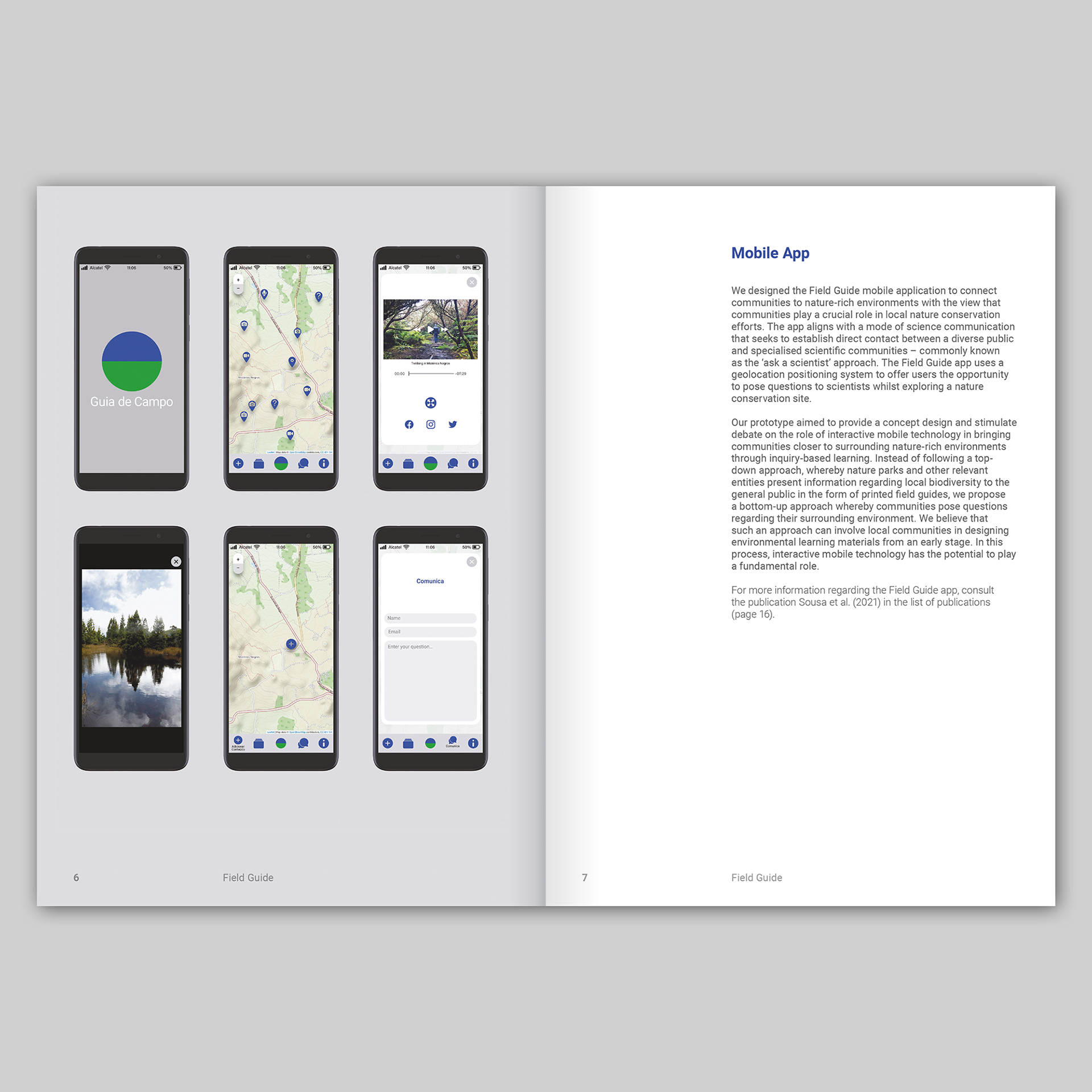
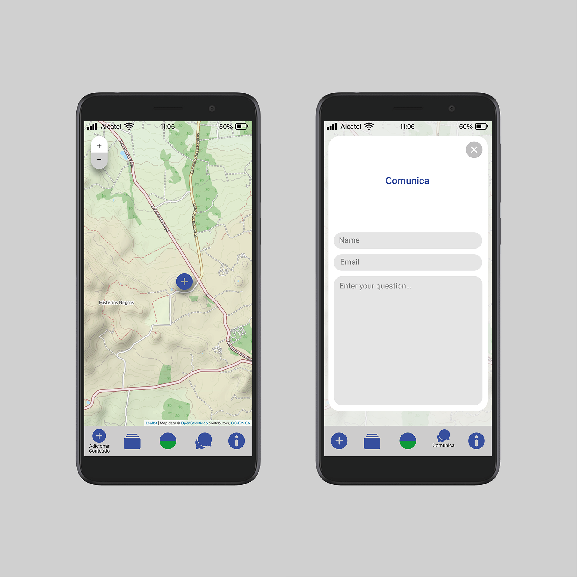
Guia de Campo App
Designed by James Brook for Madeira Interactive Technologies Institute and the Azorean Biodiversity Group at the University of the Azores, Portugal, 2021
I was commissioned to design the visual identity and interface for an app that was developed as part of Guia de Campo (Field Guide), an environmental education research project. Although interactive digital design is not my area of expertise, the leader of the project, Sónia Matos invited me to collaborate because she believed my skills and knowledge in graphic design for print could be utilised for the project, offering a different approach than might be taken by someone from a purely tech background.
Guia de Campo takes as a departing point the questions posed by children and teenagers regarding their surrounding environment. Through a commitment to place-based learning, it emphasises the importance of connecting younger generations to local environments. The project designs, develops and tests interactive technologies for place-based learning in conversation with local communities as a means to explore pedagogical strategies in the context of environmental education.
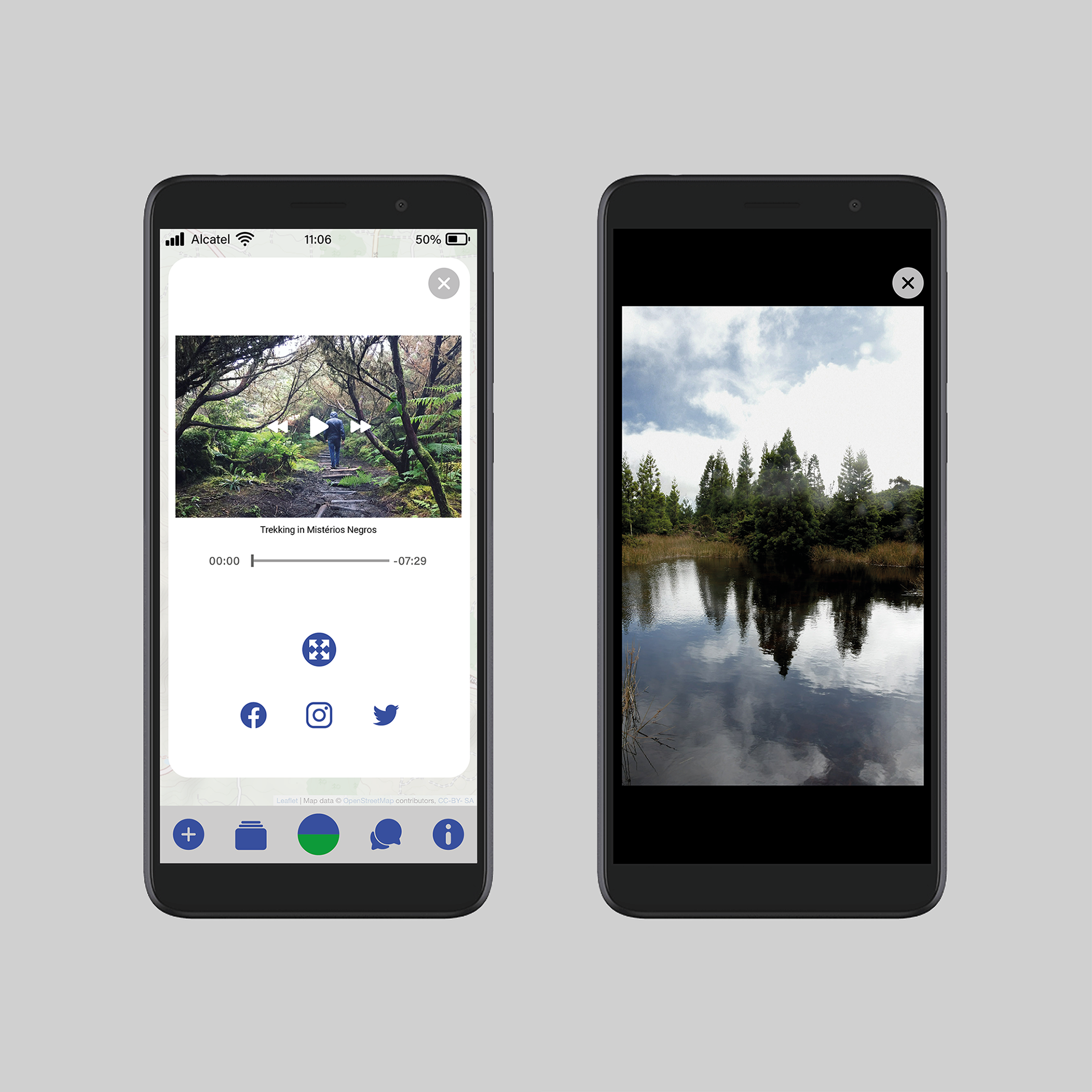
The development of the app was a close collaboration between myself and Daniel Sousa, a programmer working from Lisbon, alongside Sónia Matos, who is based in Madeira, with input from the rest of the Guia de Campo team. Throughout our discussions about the design and functionality of the app, our main focus was the end user – how they would understand the app, and how they would interact with it.
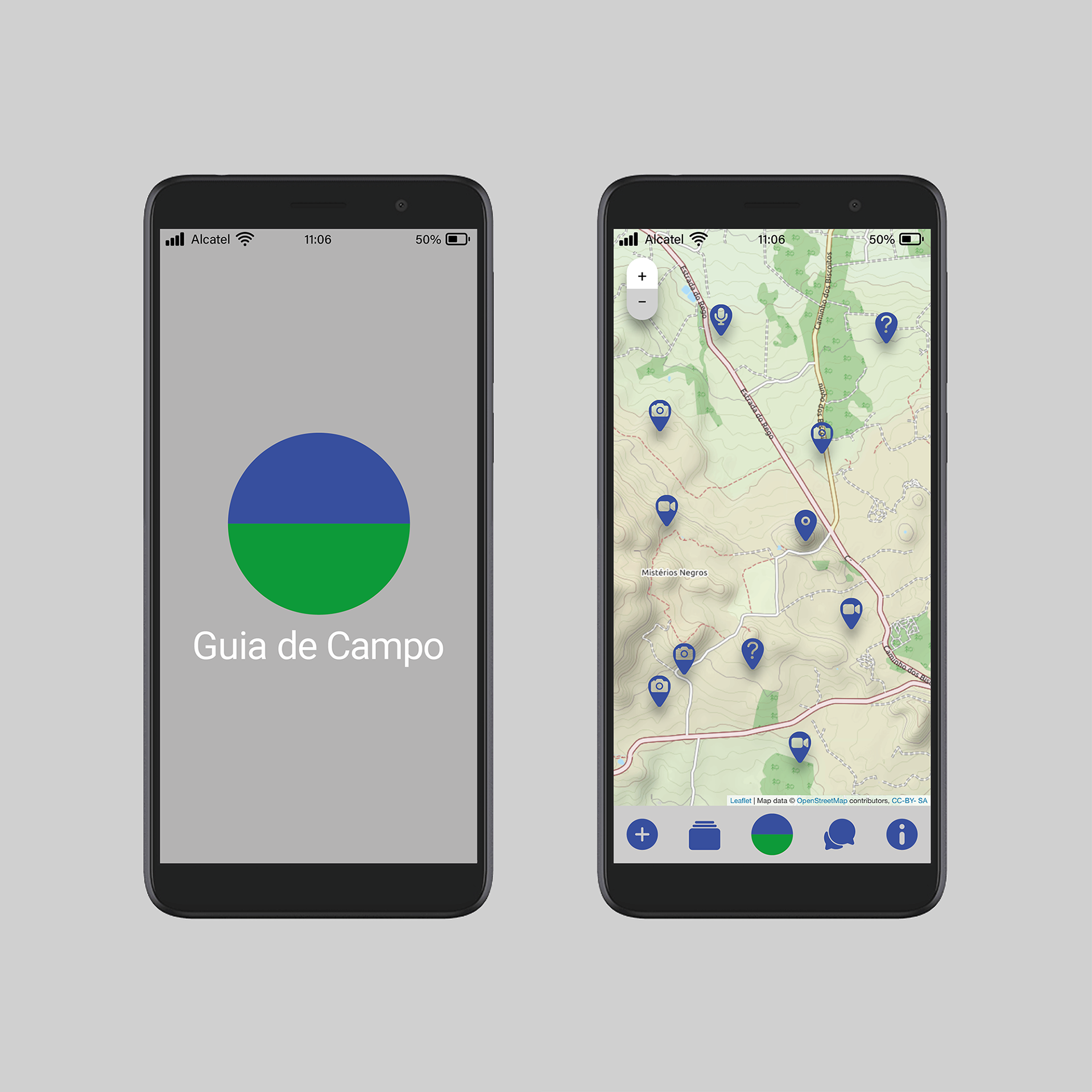
As well as designing the interface for the app I was commissioned to develop a visual identity for the project: the central feature of the identity is the Guia de Campo logo, a circle split in to two equal parts along the horizon, and coloured blue and green – a simplified echo of the landscape of the Azores. The logo appears on a grey background on the app’s loading page (above) along with the name ‘Guia de Campo’, set in the typeface Roboto regular. This typeface is used throughout the app; it was selected because, as a Google typeface, it is widely available on all platforms; Roboto also fitted the brief, which specified a clean, contemporary typeface.
For a more in-depth discussion of my approach to the design of the visual identity for the interface of the app please visit my blog here.
Field Guide Booklet
Designed by James Brook for Madeira Interactive Technologies Institute and the Azorean Biodiversity Group at the University of the Azores, Portugal, 2022
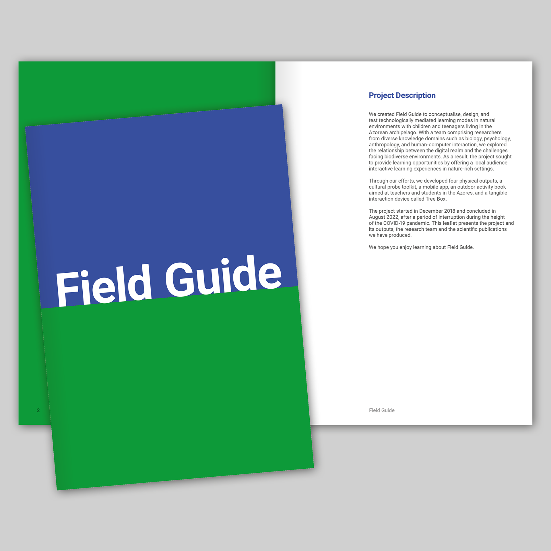
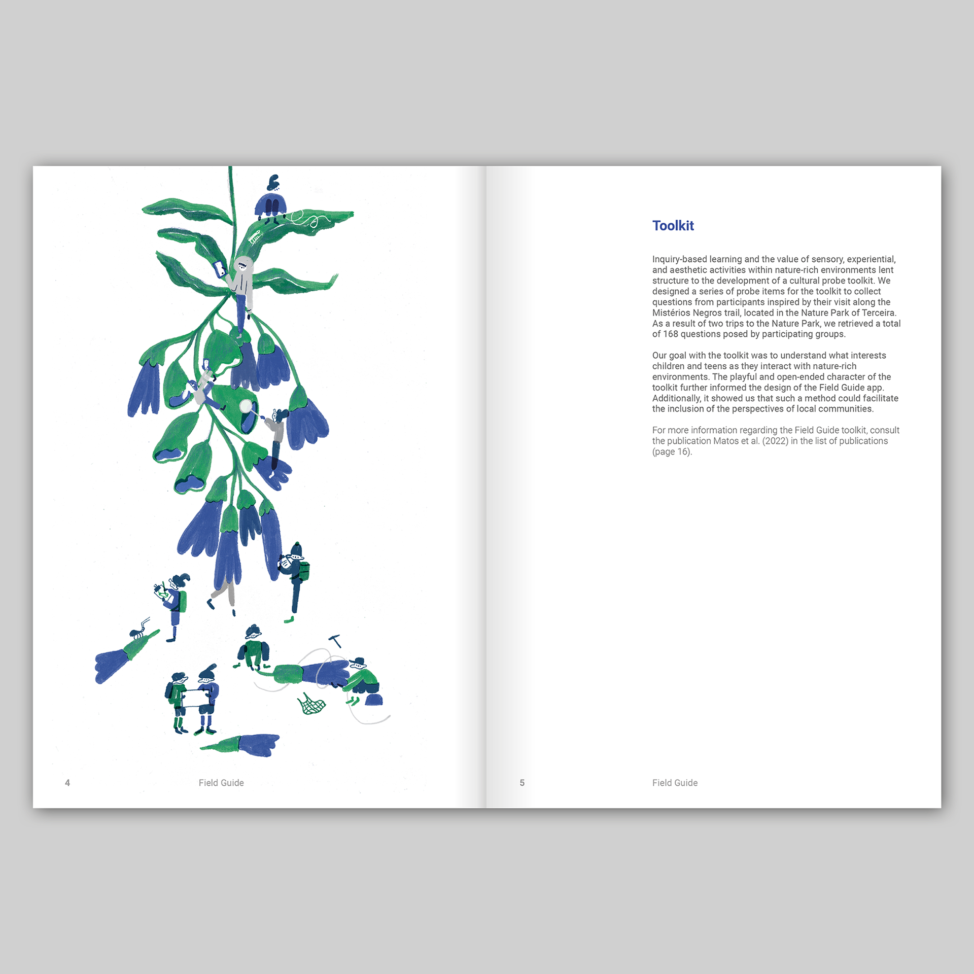
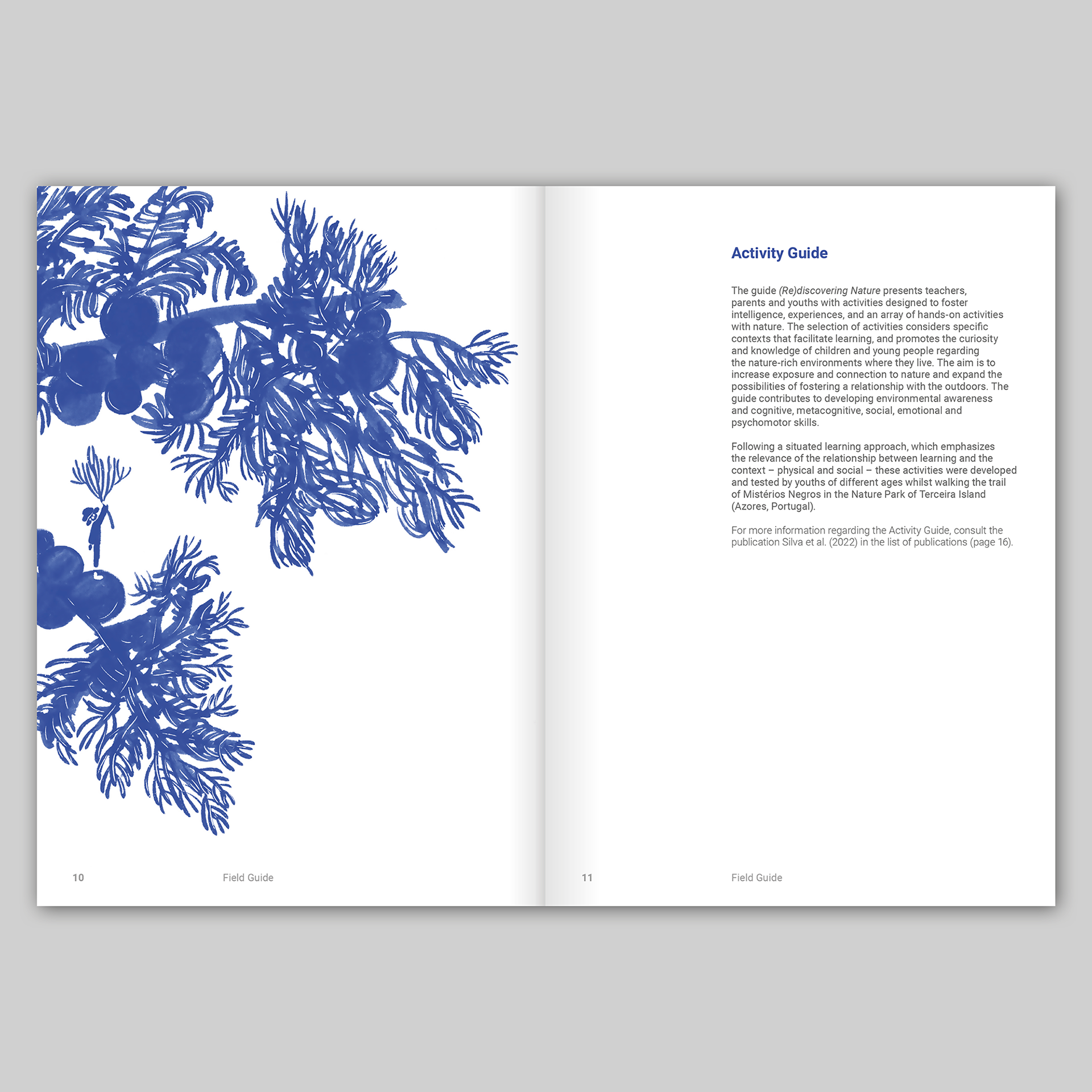
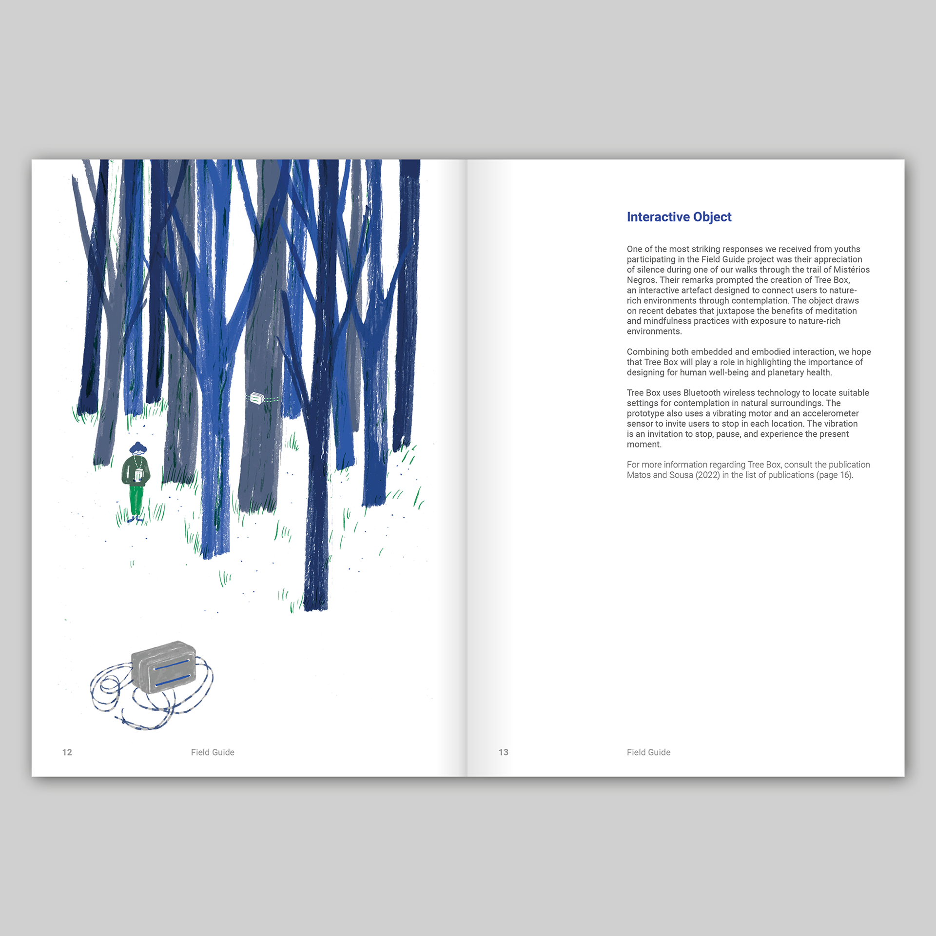
A year after the app was completed and with the project coming to a close, I was invited to design a report about the Field Guide project using the identity that I had developed for the app. The report was typeset in different weights of Roboto and used the three colours that I had specified for the app: blue, green and grey alongside illustrations by Carolina Celas, that had been used in other iterations of the project.
Project website: https://field-guide.info