Seeing Things by James Greene
Published by Golden Hare, Edinburgh, 2023
Designed by James Brook
ISBN 978 1 8384 0654 7
Paperback with flaps | 210 x 148 mm | 32 pages | Printed by Gomer Print, Wales, on 120 gsm Munken Pure Rough with anti-scuff laminated cover printed on 280 gsm Cartel Lumina Silk single sided board
This small book of poems, Seeing Things, is a farewell collection by James Greene. Previous publications by Greene include the first collection of his own poetry, Dead-Man’s Fall (published by The Bodley Head 1980) and A Sad Paradise (published by Lines Review Editions, Macdonald 1990) as well as a number of translations of poetry by Russian poet Osip Mandelshtam and others. Greene has written the plays Killing Time in the Kremlin and The Bin, and his work has featured in the London Review of Books.
For this publication, I worked very closely with James Greene, his partner Nicky Sherrott and his ‘virtual secretary’ Mae Walsh, working through several options for the layout and design of the book. The book is A5, 210 x 148mm, chosen to match another book of poetry published by Golden Hare, and I worked hard to find a layout that could accommodate the length of the longest poem on one page and that also accommodates the longest line of each poem without breaking at this size – I was pleased that only one very long poem had to be broken across two pages.
The book is typeset in Minion Pro which I selected because of its relatively tall x-height and because of its open character and clarity of reading. The poems are set in 11 point Minion while the secondary information (Acknowledgements, Notes, Contents etc) are typeset in 9.5 point Minion – it was necessary to go smaller on these sections as there was a lot of information to fit in a small space but the positive effect of this is that the poems have precedence because of the larger point size that they are set in. Titles and section headings are typeset in uppercase Century Gothic. A strong underlying grid gives structure to the book and helps unify the different sections. The grid and typography is continued on to the cover and the cover flaps.
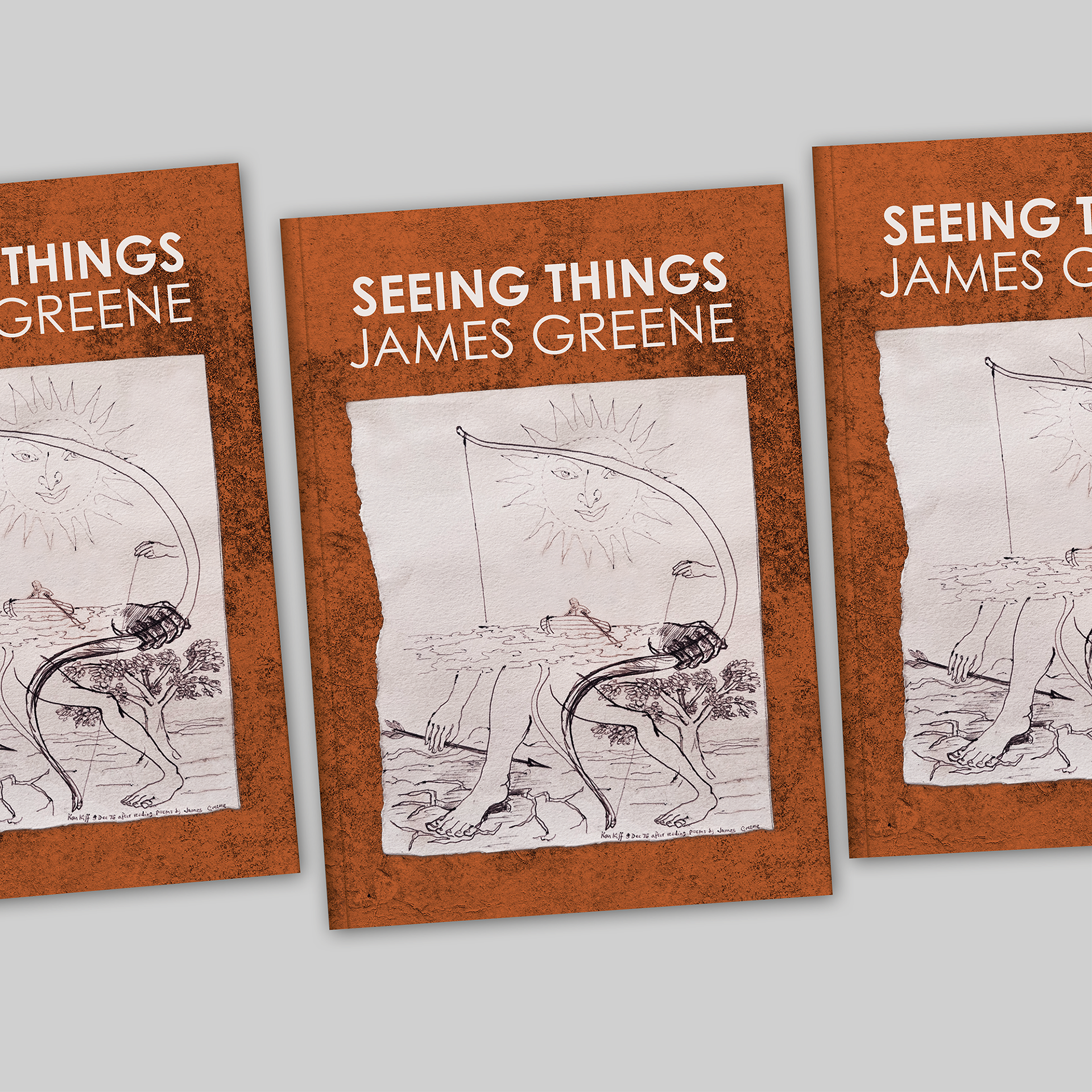
The cover features a drawing by Ken Kiff given to James Greene. The drawing itself had become stained and discoloured so, working from an image of the drawing I Photoshopped away the staining and removed the drawing from its backgound – I also adjusted the colour balance based on feedback from the poet and his partner. I generated a textured coloured background for the cover which wraps around the front, back and flaps of the cover; I gave several options for the colour but it was this orange that appealed to the poet. The cover is printed on 280gsm Cartel Lumina Silk – it is coated on one side only allowing the cover to be matt laminated but I decided that the white tone of the paper would have sat starkly next to the creamy colour of the text paper, 120gsm Munken Pure Rough, so I suggested that the inside of the cover should be printed in a soft off-white colour that is sampled from the Ken Kiff drawing. This sampled colour also appears on the cover typography.
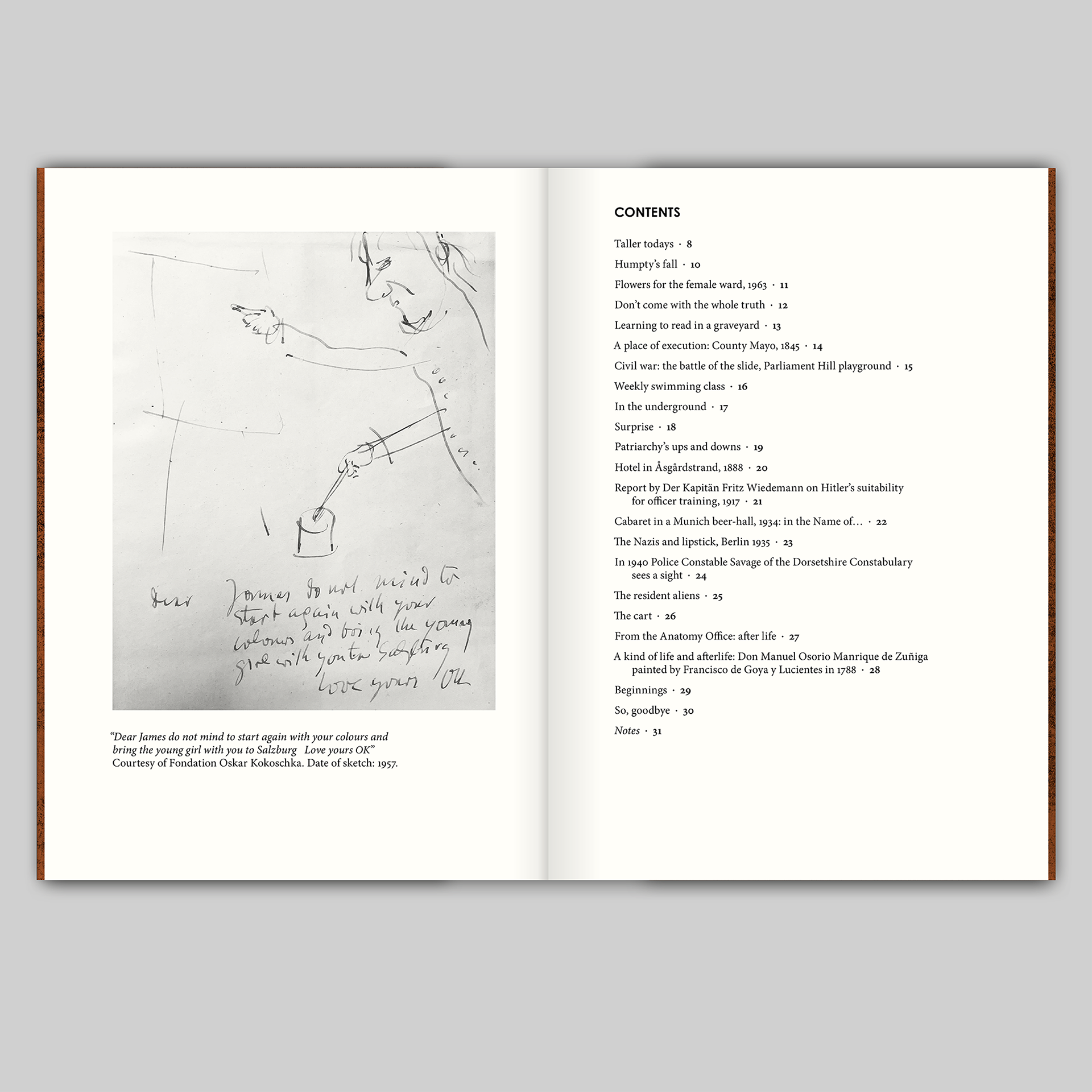
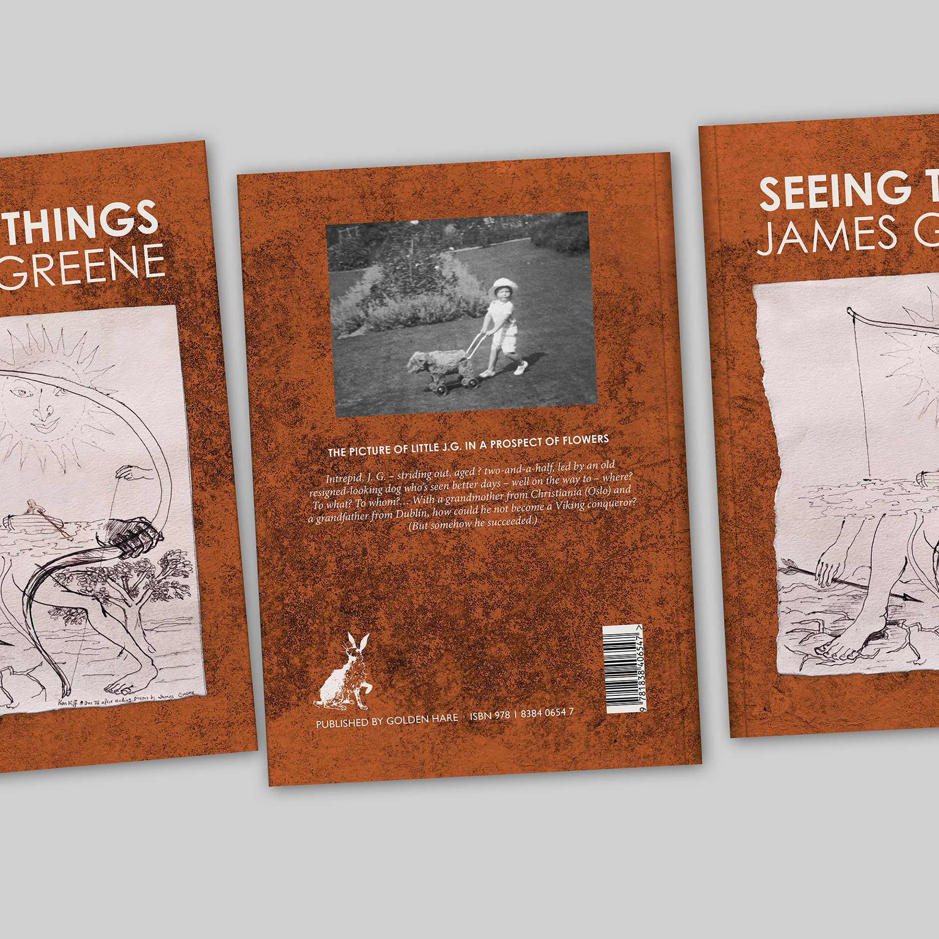
The back cover includes a photograph of the poet, aged two-and-a-half, and there is a reproduction of a drawing by Oskar Kokoschka next to the contents page – both of those images needed some adjusting to make ready for print.
This is the first book of poetry that I have designed and I feel privileged to have had some very illuminating conversations with the poet about the typographic layout and form of his poems including an interesting debate about whether some of the poems should be justified left and right and some ranged left (as specified in the poet’s original manuscript). James Greene died on 19 May 2023; I am honoured to have been involved with this ‘farewell collection’.

From Nicky Sharrott: The boxes arrived from the printers yesterday – what excitement. Mae and I are delighted with the results: JG is on a cloud, nodding his head in approval. Just as he wanted. It’s such a poignant tribute. All the trouble you went to, James B, with the layout, the font, the choice of paper, the italics and numerous other things, whilst JG’s amendments were running close to the wire – you were so patient, and your good and timely advice paid off. I am very thankful and grateful to you.