Perspectives Magazine
Published by Haileybury, 2022 – 2024
Edited by Toby Parker
Designed by James Brook
Perspectives is a magazine published by Haileybury School that was initiated from a desire to showcase the school’s heritage, current academic and cultural issues with new research about the school’s collections. Edited by Toby Parker, the Heritage Director and College Archivist at Haileybury, the magazine aims to examine the school’s role in a variety of cultural practices and issues, and to think critically about the way in which it interacts with other cultural institutions locally, nationally and globally.
For the design of the magazine, I worked closely with the editor, and through a series of conversations and exchanges of visual material, I developed a design that makes some nods to Haileybury’s visual branding but which is distinct enough to stand alone.
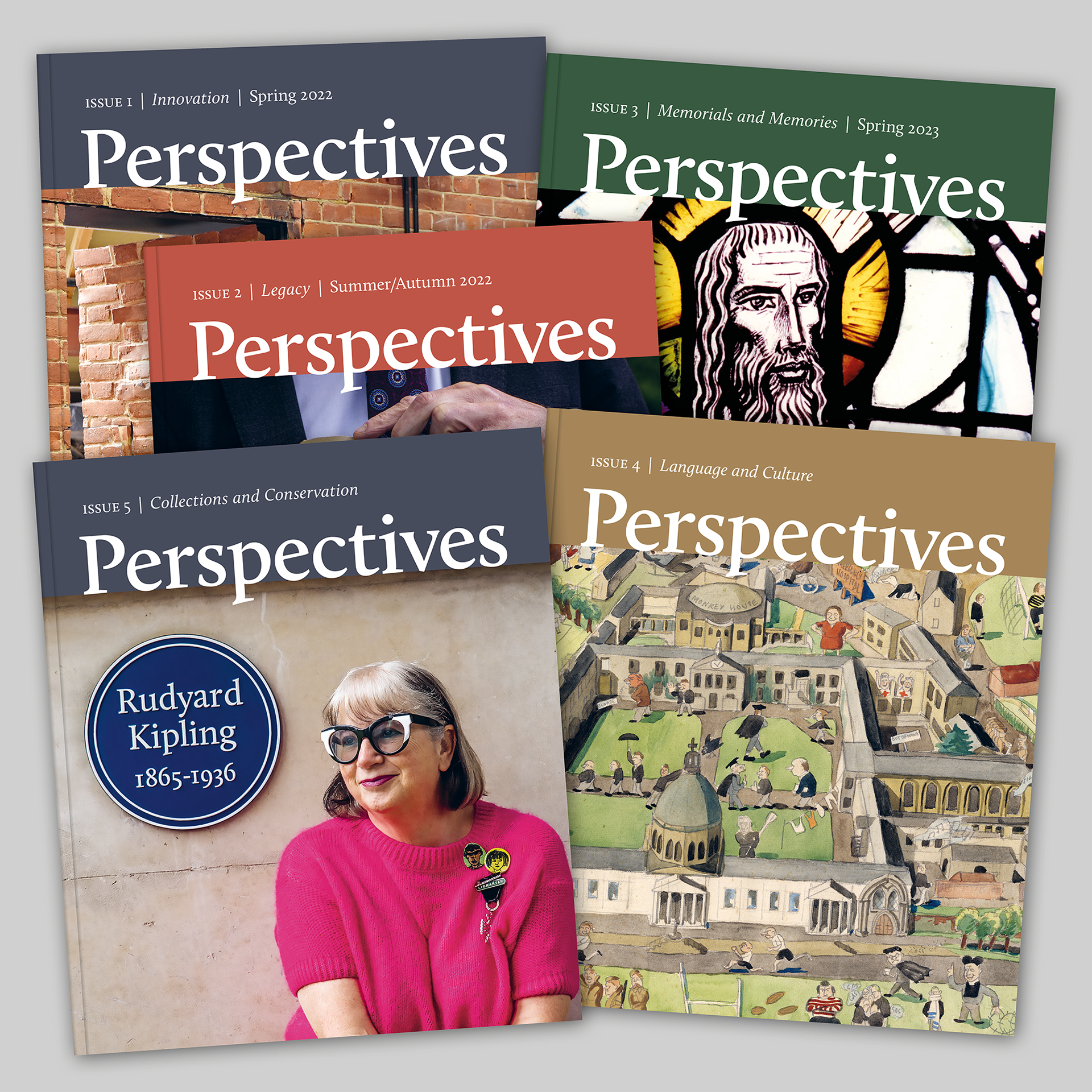
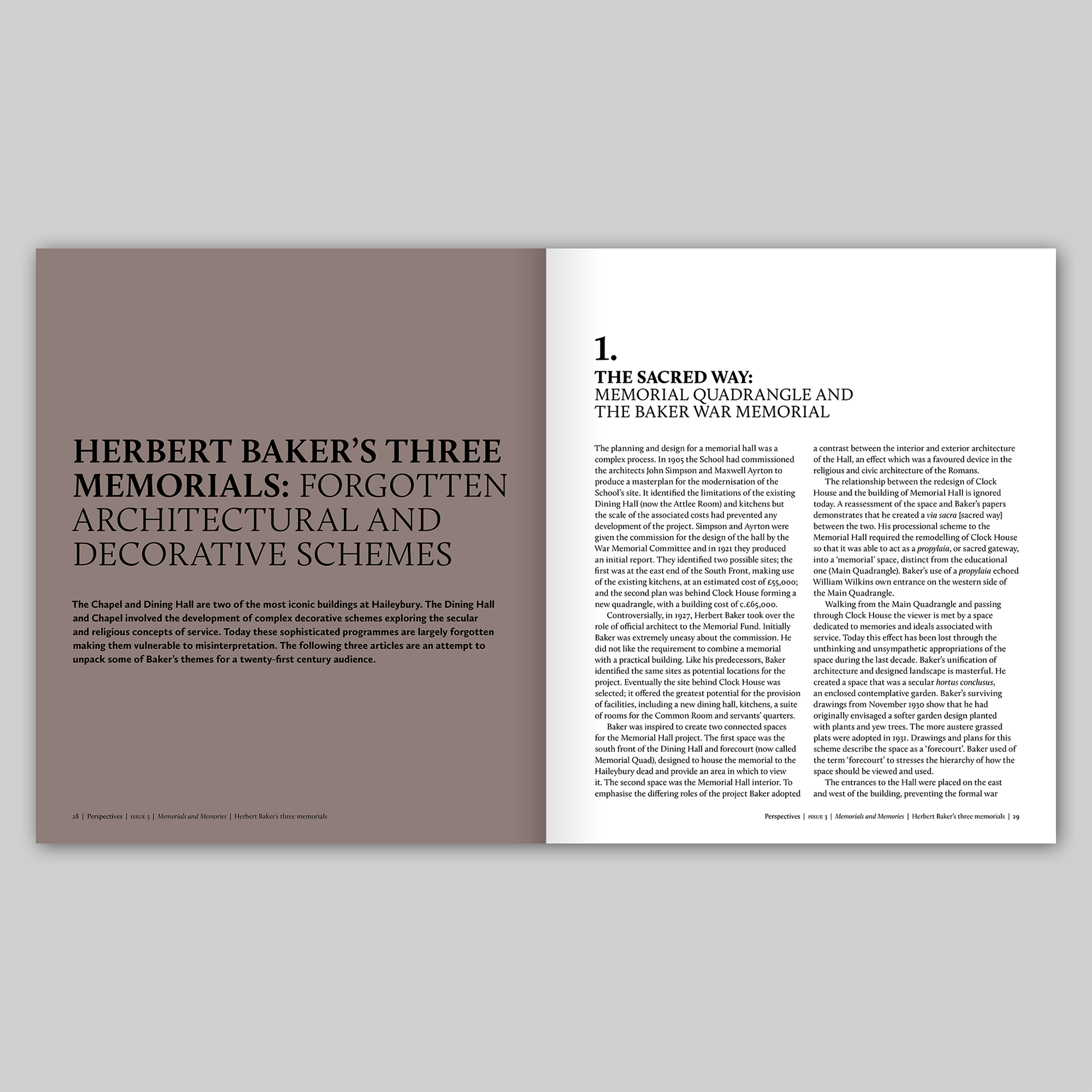
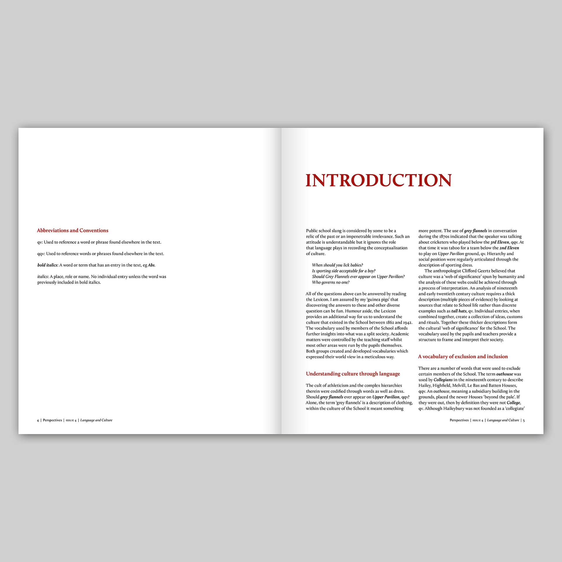
The design is based around a rigourous but flexible layout that can accommodate different types of information, giving each section of the magazine its own distinct identity. The basic layout is a three column grid with type arranged on one, two or three columns giving a variety that helps differentiate each article. Titles, body text and images are often hung from a guideline that runs through the magazine giving a sense of order which is occasionally broken to create emphasis or visual energy. Images are prioritised throughout the magazine, often at full bleed. I have used type at different sizes, weights and combinations to create interesting titles and headers, arranged in sometimes playful ways with the text and images.
I initially considered using a pair of typefaces that had been designed to work together such as Meta Pro and Meta Serif Pro or Freight Sans Pro and Freight Text Pro. However, the school’s branding is based around the serif typeface Calluna and its match Calluna Sans, so, although not a requirement of the deign brief to do so, it made sense to use these typefaces in the magazine. Calluna has some interesting and quirky characteristics that are revealed when the typeface is used at a larger scale, as on the masthead and in some of the larger titles.
I created a palette of four colours that are used in rotation on the masthead and cover: ‘Perspectives Blue’, ‘Perspectives Gold’, ‘Perspectives Green’ and ‘Perspectives Red’. Designed to work together, different tints of these colours are used throughout the magazine to create a cohesive suite of colours with different moods and atmospheres that respond to images and the tone of individual articles in the magazine.
Over five issues, the design of the magazine has developed and adapted to accommodate different types of material but is still based on the basic three column grid that I designed for the first issue and still utilises my initial choice of typefaces, Calluna and Calluna Sans, a testament to the versatility of my original design and layout.
Perspectives Issue 1: Innovation
Perspectives Issue 2: Legacy
Perspectives Issue 3: Memorials and Memories
Perspectives Issue 4: Language and Culture


Perspectives Issue 5: Collections and Conservation