Kate Downie: Between Seasons
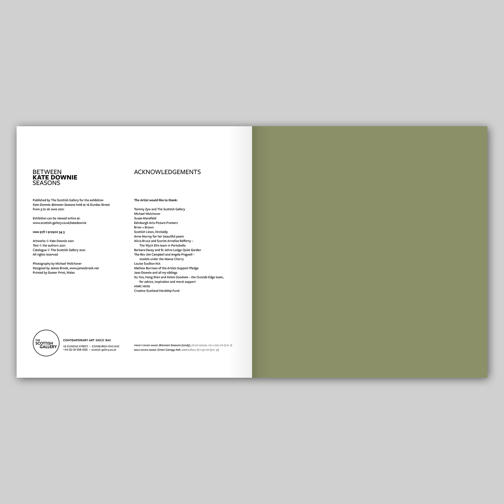
Published by The Scottish Gallery, Edinburgh, 2021
Texts by Kate Downie, Susan Mansfield and Tommy Zyw
Photography by Michael Wolchover
Designed by James Brook
ISBN 978 1 912900 34 3
Soft cover | 235 x 220 mm | 56 pages | Printed by Gomer, Wales on 170 gsm Galerie Art Matt with a cover of 350 gsm Galerie Art Matt
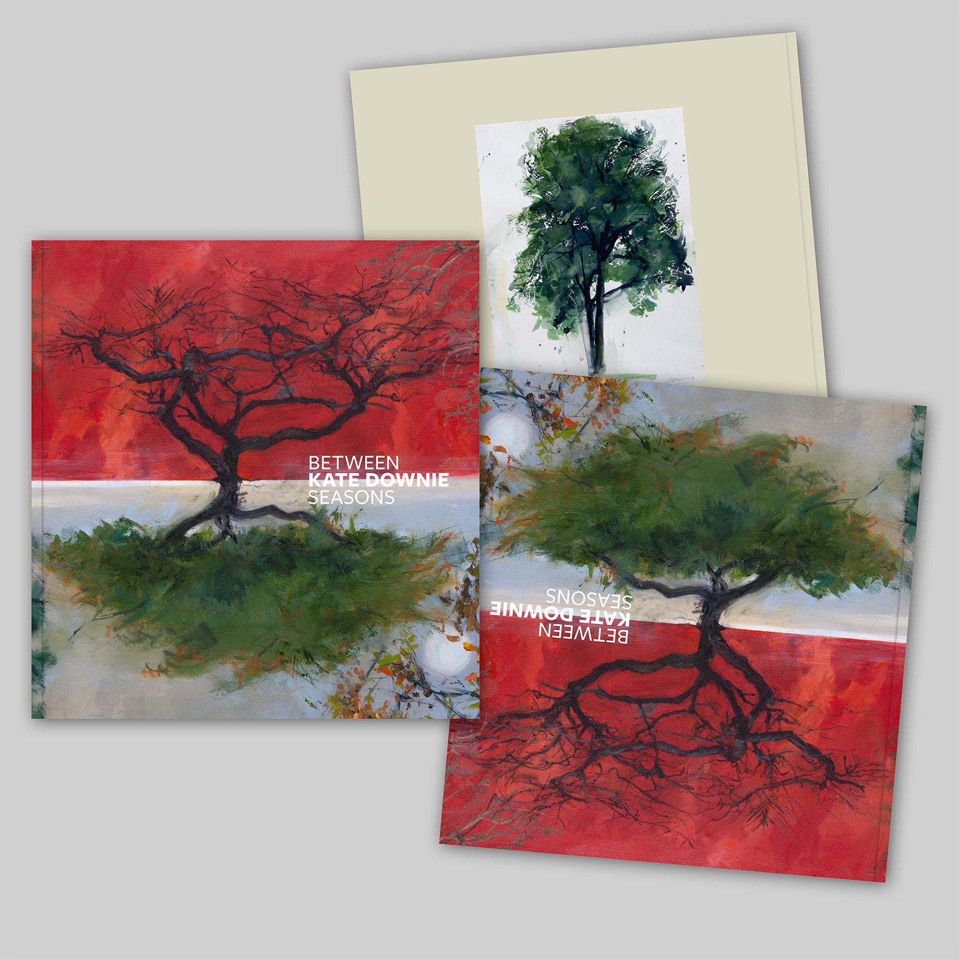
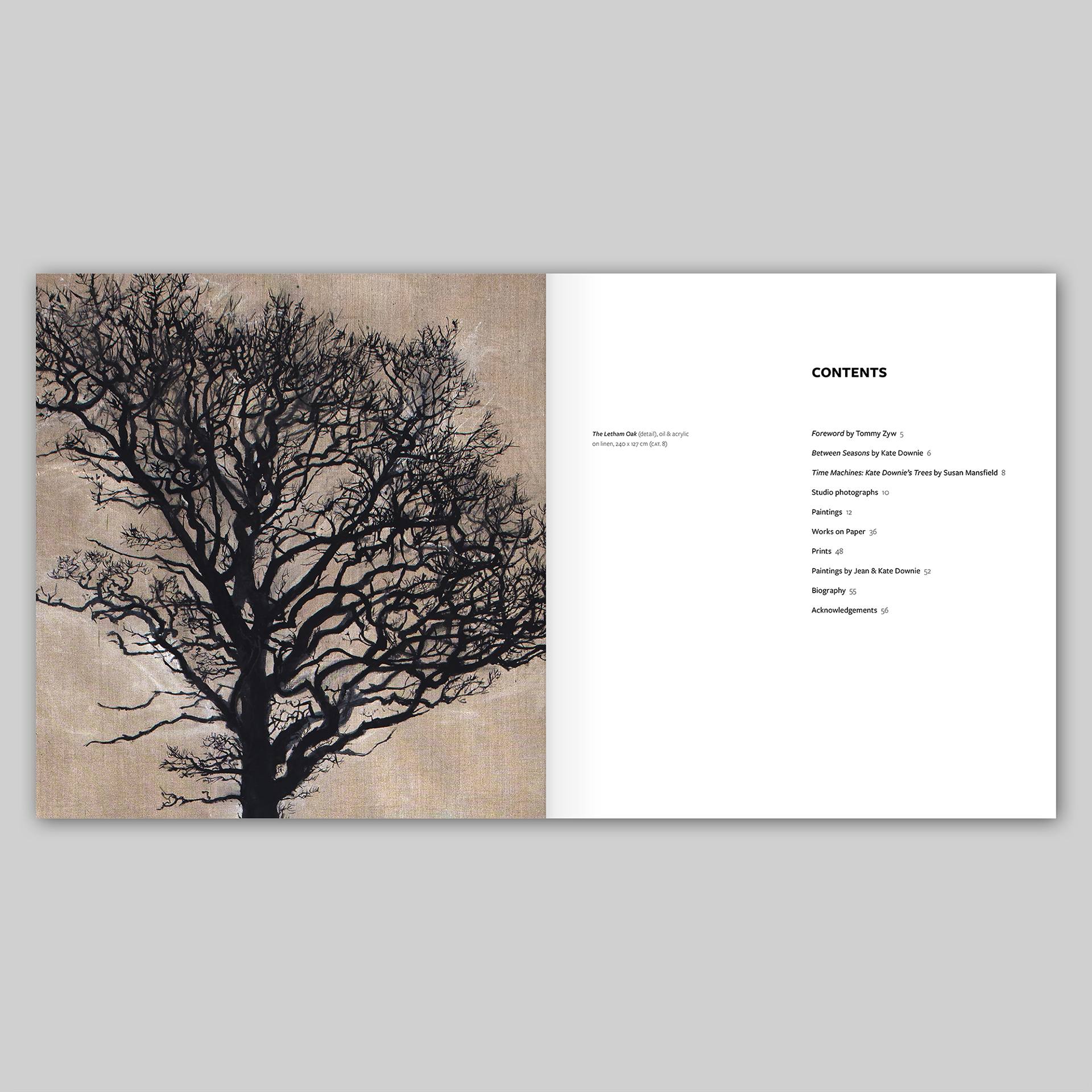
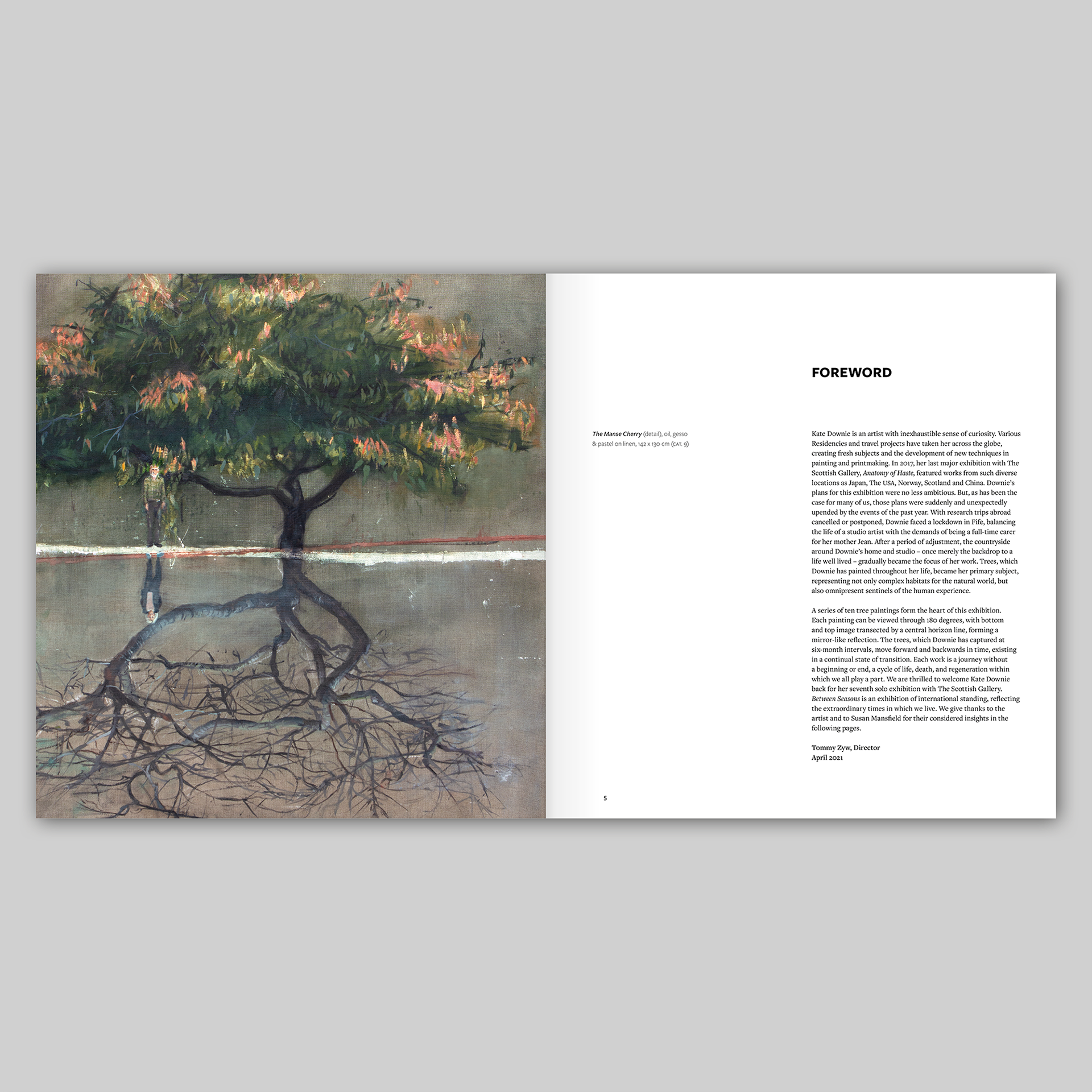
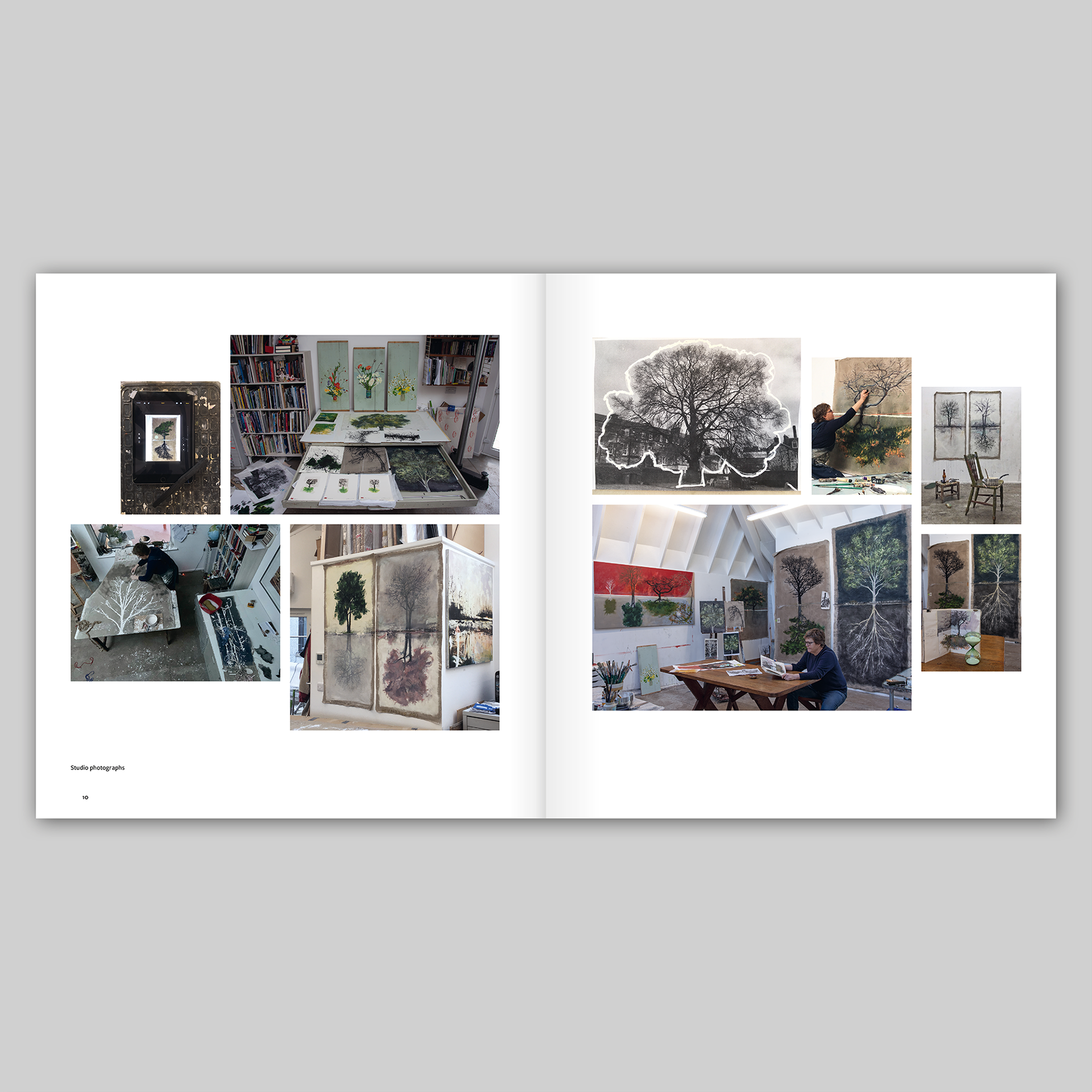
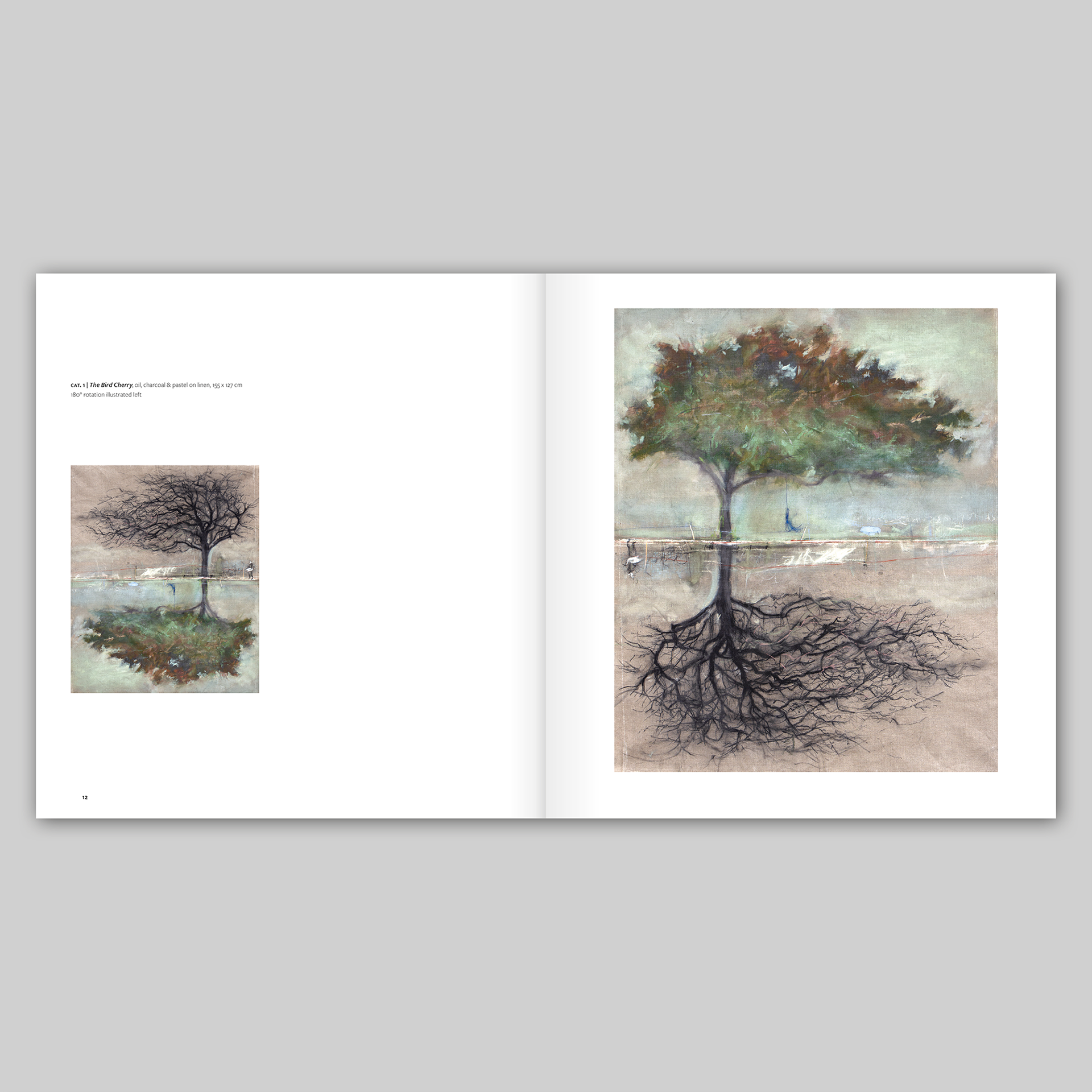
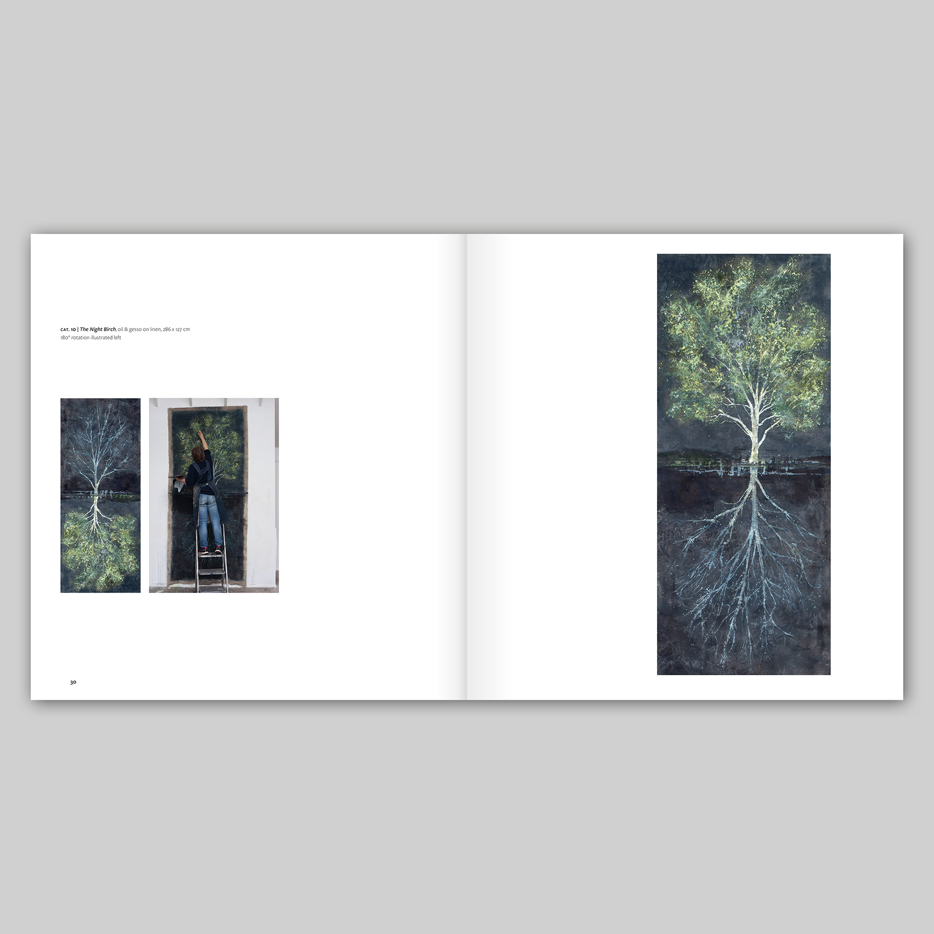
Between Seasons is a catalogue that accompanied Kate Downie’s exhibition at The Scottish Gallery in Edinburgh from 3-26 June 2021. At the heart of the exhibition was a series of ten paintings of trees painted throughout the seasons, during the time of the Covid-19 pandemic lockdown. The paintings are all divided by a central horizon line with two representations of a tree in different seasons; the bare branches of winter contrasting with the full canopy of summer. Each painting can be turned through 180 degrees so that one of the the two representations is uppermost, changing the atmosphere of the painting completely – during the course of the exhibition, the paintings were rotated periodically. In the catalogue, this problem of there being no right way up for the paintings has been solved by having a larger image of the painting on one page and a smaller image of the painting turned full circle on the facing page; some of these images are accompanied by a further photograph showing Kate working on the painting in her studio (often on a ladder) to give a sense of scale – they are vast!
I worked closely with the artist on the book along with Tommy Zyw, the director of The Scottish Gallery. I typeset the book in a combination of Freight Sans Pro and Freight Text Pro, a clear and understated typeface that, with its unified serif and san-serif versions and a wide range of weights and styles, offers a wide palette of contrasts to design with. The choice of typefaces, combined with the use of white space, has given a clean and contemporary feel to the book that gives the paintings room to breathe and allows them to shine. I cut out some of the works on paper and gave them a subtle drop shadow to amplify the sense of them being objects. The book has a strong physical presence, and, as the artist remarked: “It feels just great ‘in the hand’ as an object. The size is just right.”
I’m very pleased with the design of the front cover: the combination of a detail from Kate’s painting and the arrangement of type that I devised for the title treatment works very well, I think, offering a hint of the typography and layout of the book as well as a teaser for Kate’s wonderful series of paintings.

Tommy Zyw, Director, The Scottish Gallery: I have had the pleasure to work on several exhibition catalogues with James Brook. James understands the individual requirements of the artist, gallery and audience. He has an in-depth knowledge of design and printing. This he combines with creative flair and a practical and hardworking approach.