Meadow Arts: the first 20 years
Published by Meadow Arts, 2021
Edited by Tom Jeffreys and Anne de Charmant
Designed by James Brook
ISBN 978 1 5272 8036 6
240 x 165 mm | 80 pages | Printed by Gomer, Wales on 170 gsm Galerie Art Matt with laminated printed paper over board cover with UV spot gloss varnish on the title and quarter bound spine of Fedrigoni Woodstock
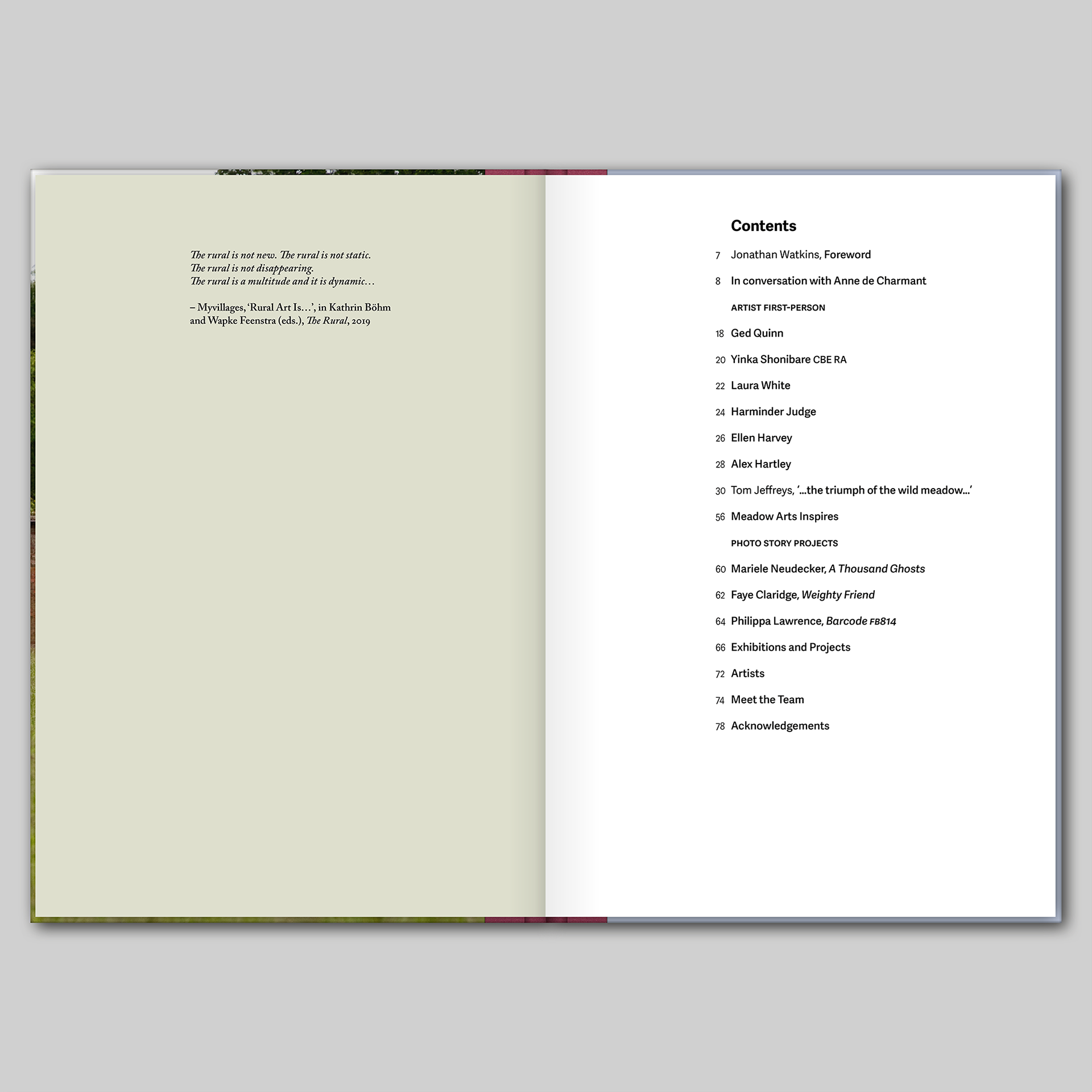
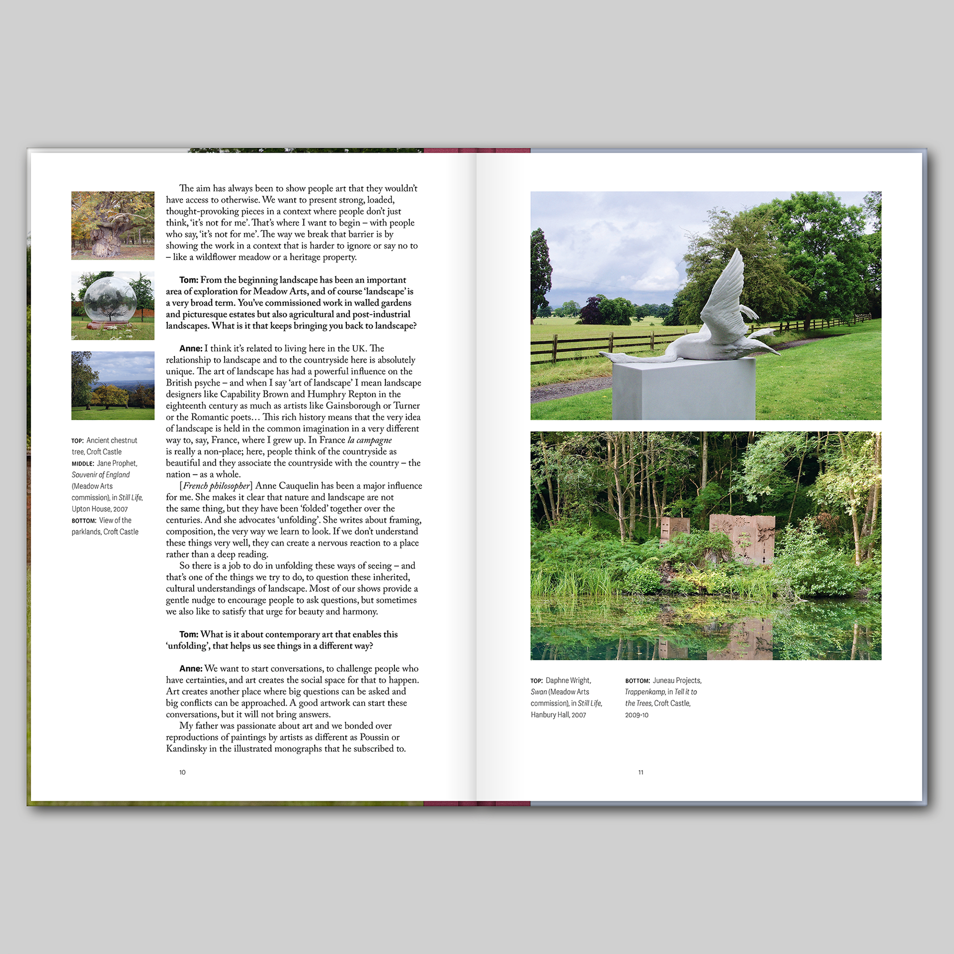
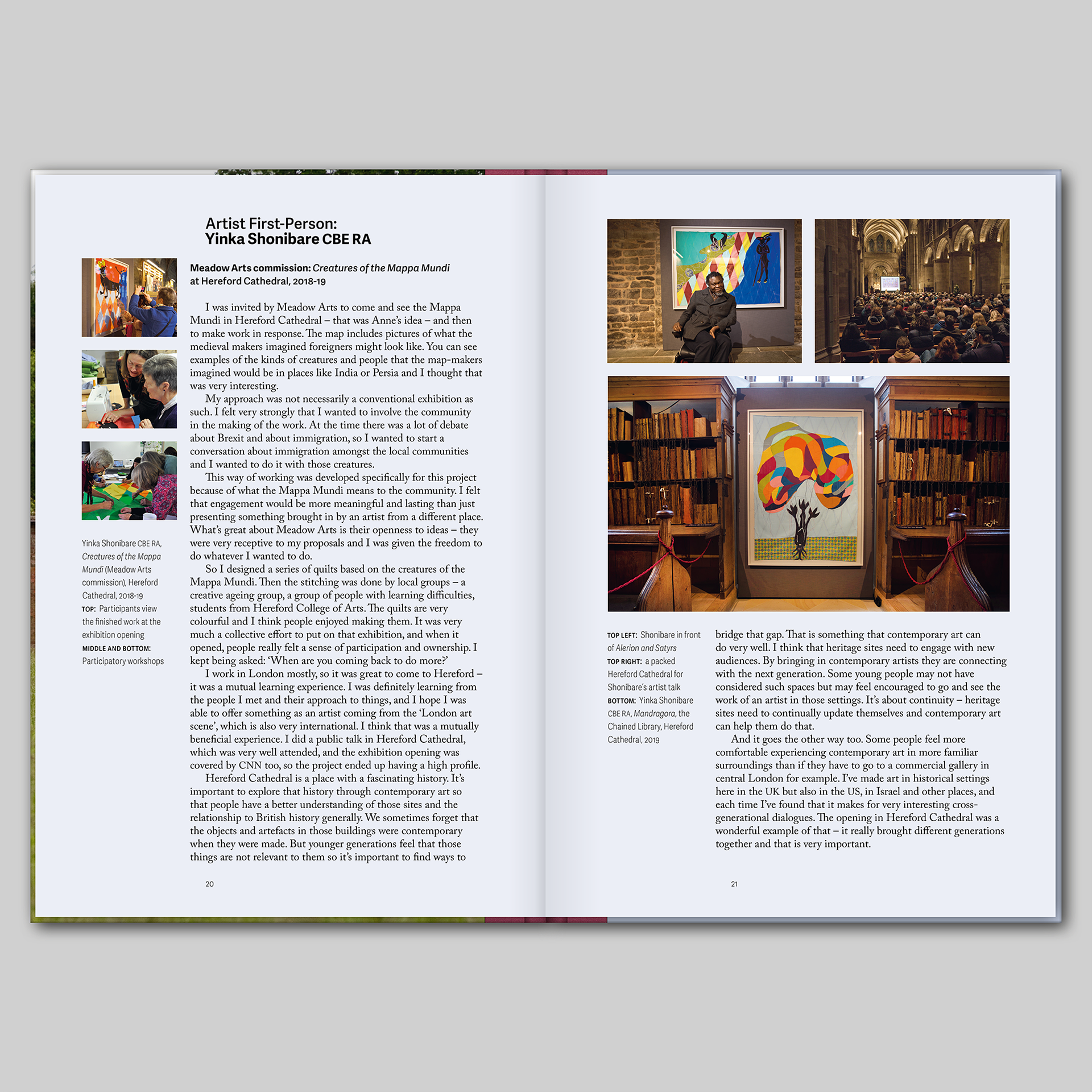
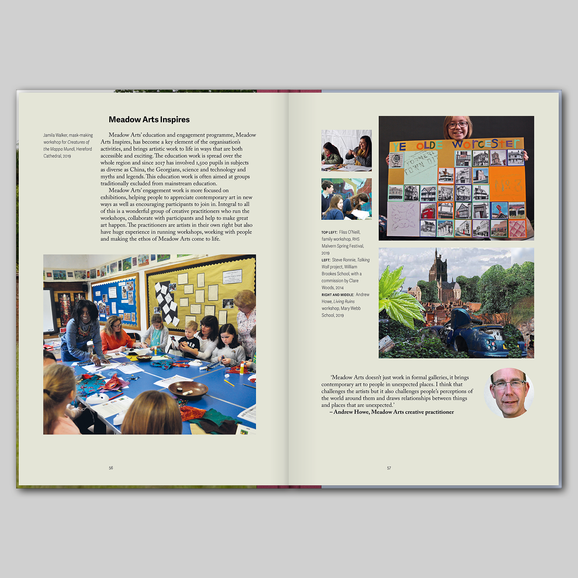
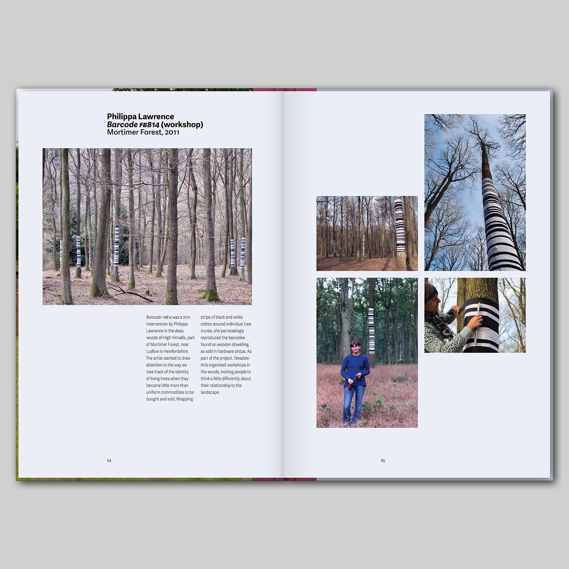
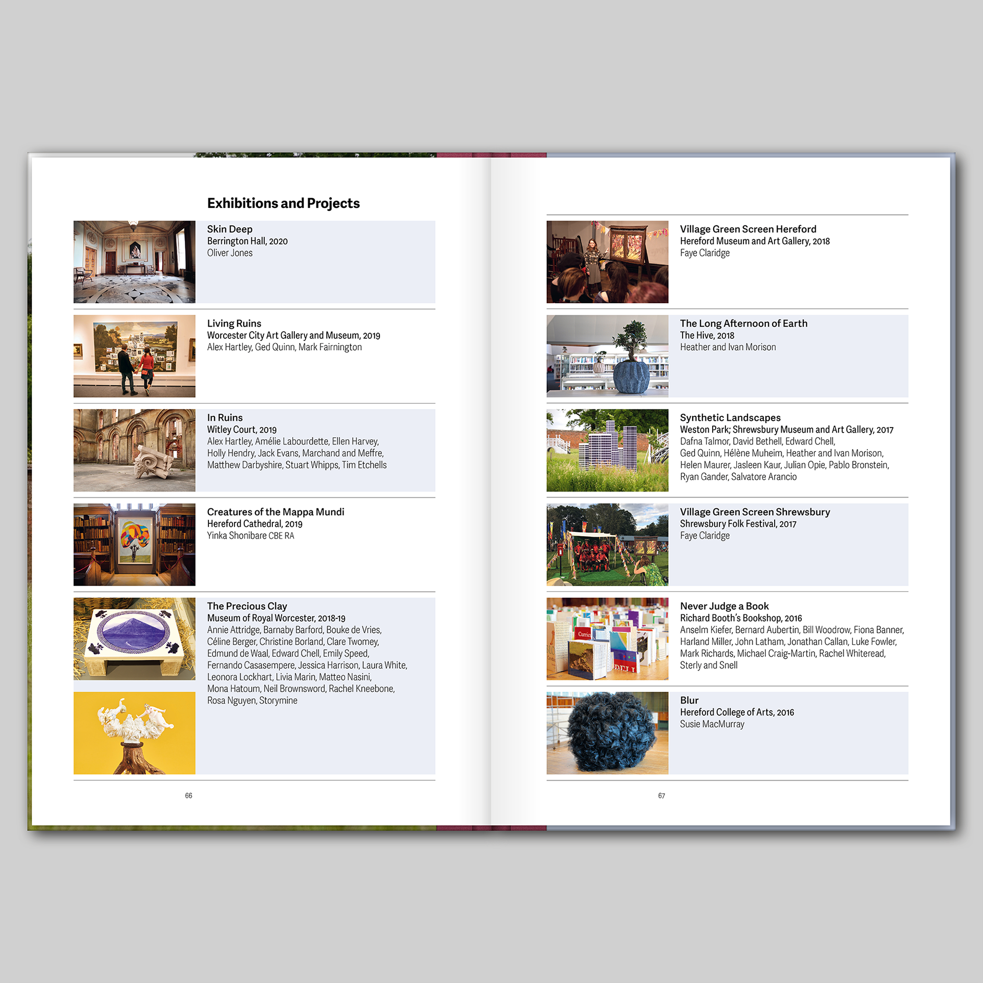
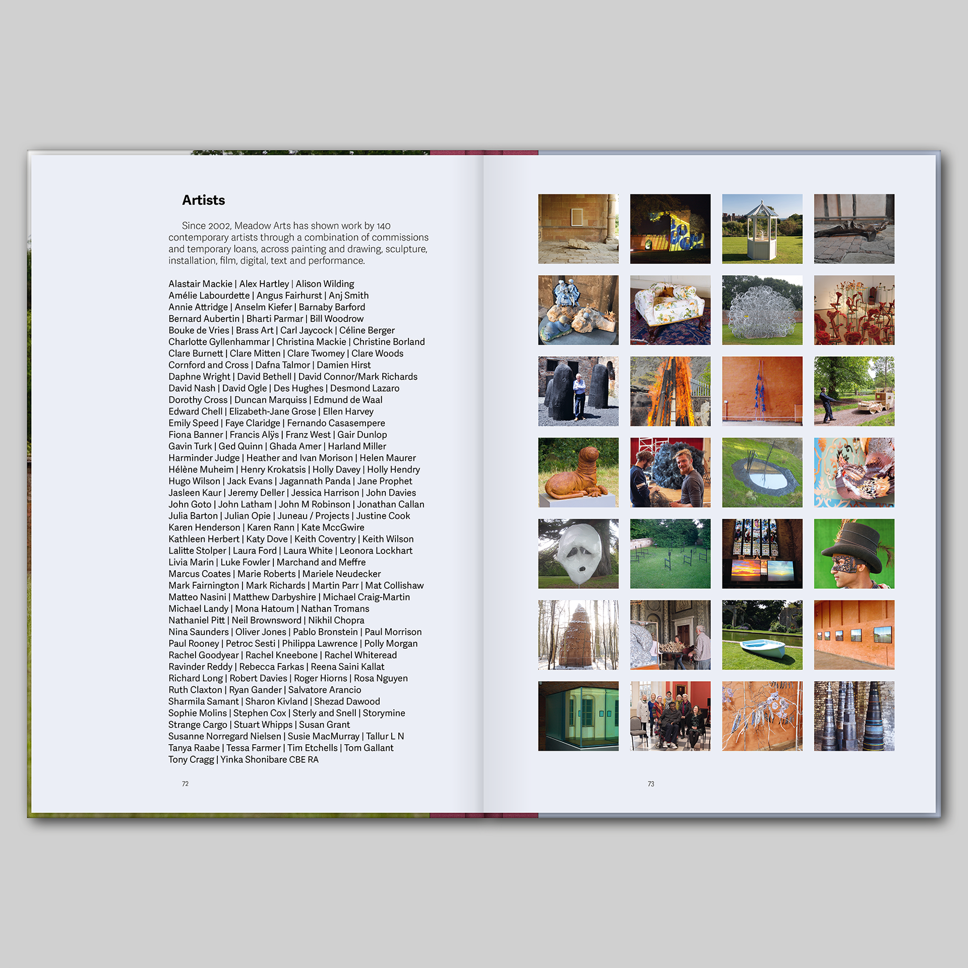
This is a book that I designed for Meadow Arts, an organisation that brings unique contemporary art projects to places where art is not usually shown, supporting artists by commissioning new work and creating inspiring events and exhibitions. In 2021, the organisation celebrated twenty years of delivering ambitious and accessible projects in unexpected rural places – Meadow Arts: the first 20 years is a celebration and long-lasting record of these extraordinary – and temporary – projects, featuring contributions from Yinka Shonibare, Alex Hartley, Laura White and Harminder Judge, alongside photo stories from Mariele Neudecker, Philippa Lawrence and Faye Claridge; it includes a foreword by Jonathan Watkins, an essay by art critic Tom Jeffreys, and an in-depth interview with founder and curator Anne de Charmant.
The book is visually rich with almost 200 colour images that are placed next to their references within the various texts – working closely with Meadow Arts, there were several iterations before the final position of the images was settled. The design is based on a strict underlying grid and rigorous typography which, nevertheless, is highly adaptable to accommodate different types of information. The book is typeset in various weights and styles of Adelle Sans alongside Caslon Pro creating a rich palette that could be adapted to create multiple hierarchies and emphases on the page. The book is divided into several sections each requiring a different typographic treatment; the sections were made even more distinct by the subtle use of colour – I created a palette of colours, sampled from some of the imagery in the book, that were used throughout the publication, including subtle tints on the pages.
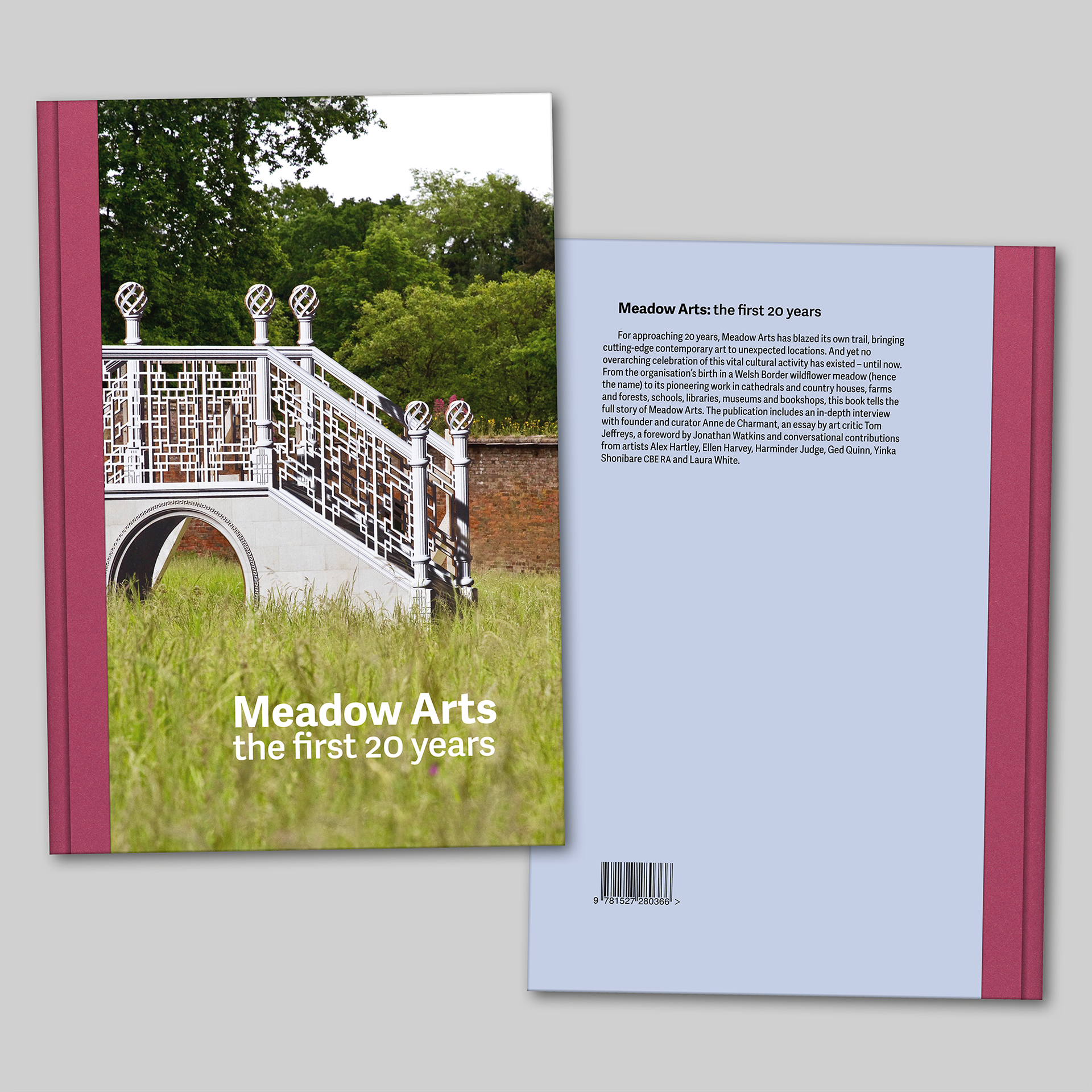
For the cover, I was keen to use a photograph of a work by Pablo Bronstein, Chinese Bridges in Landscape, a Meadow Arts commission from 2017, because I felt that, in a single image, it encapsulated all that Meadow Arts is about. The cover is laminated printed paper over board with a printed quarter spine of Fedrigoni Woodstock – after much deliberation, we selected the colour ‘Malva’ as it picks up on the colour of the wildflowers in the foreground of the photograph. The spine is printed with the title of the book in black, and there are head and tail bands that also pick up on these colours. The endpapers of the book are also in Fedrigoni Woodstock Malva giving a tactile feel and a contrast to the matt laminate on the cover. As a final flourish, to amplify the celebratory feel, the reversed out white letters of the title on the cover are picked out with a gloss UV spot varnish.
Anne de Charmant, Artistic Director & Curator, Meadow Arts: Working with James on our first publication was an incredibly stress-free and rewarding experience. He immediately understood what type of publication we wanted and he gently steered us towards the finish line with a very special blend of calm and purpose. His careful planning of the work-load and attention to detail bought out the best in all involved. At all time we felt we were in the safest of hands.