Mid-Century Modern Identity
I was asked to design an identity for the marketing material to promote Dovecot’s Mid-Century Modern: Art & Design from Conran to Quant, an exhibition which ‘presents the design, fashion, and art of a group of radical young architects, designers, photographers, and artists who redefined the concept of youth and the established order of post-war Britain’. An aspect of the brief was to create an identity that would make links with the cover of Swinging London: A Lifestyle Revolution, an already-published book that acted as a catalogue to the exhibition.
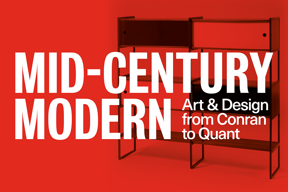
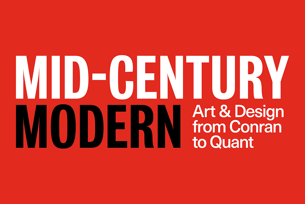
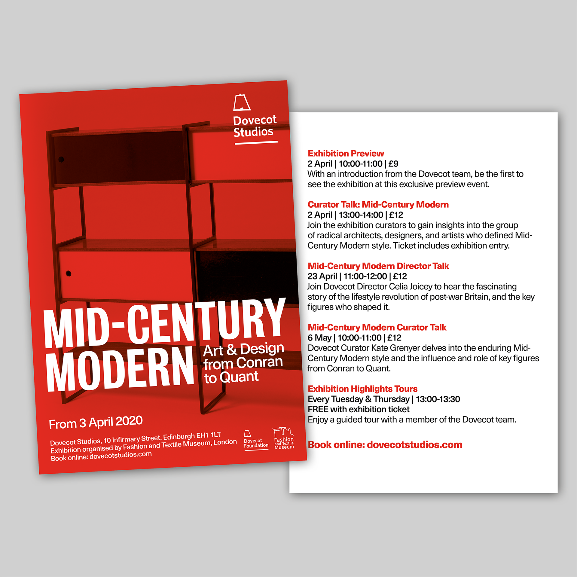
The book cover informed the choice of typefaces used on the marketing material as well as the colour palette of red, white and black. For my designs, the exhibition title is typeset in Bureau Grot Condensed with a customised, shortened hyphen and the remaining copy set in Neue Haas Unica: both typefaces were designed later than the focus of the exhibition, but their roots are much earlier, so are fitting for an exhibition of swinging sixties modernism (Unica was originally released in 1980 but was based on two earlier typefaces: Univers, which was originally released in 1957; and Helvetica, a typeface that is one of the hallmarks of the International Typographic Style that emerged from the work of Swiss designers in the 1950s and 60s. The sans-serif Bureau Grot was developed in 1989 and is based on grotesque typefaces from the nineteenth-century that I believe were often used by designers in the sixties as a substitute for Helvetica, which was less widely available at that time).
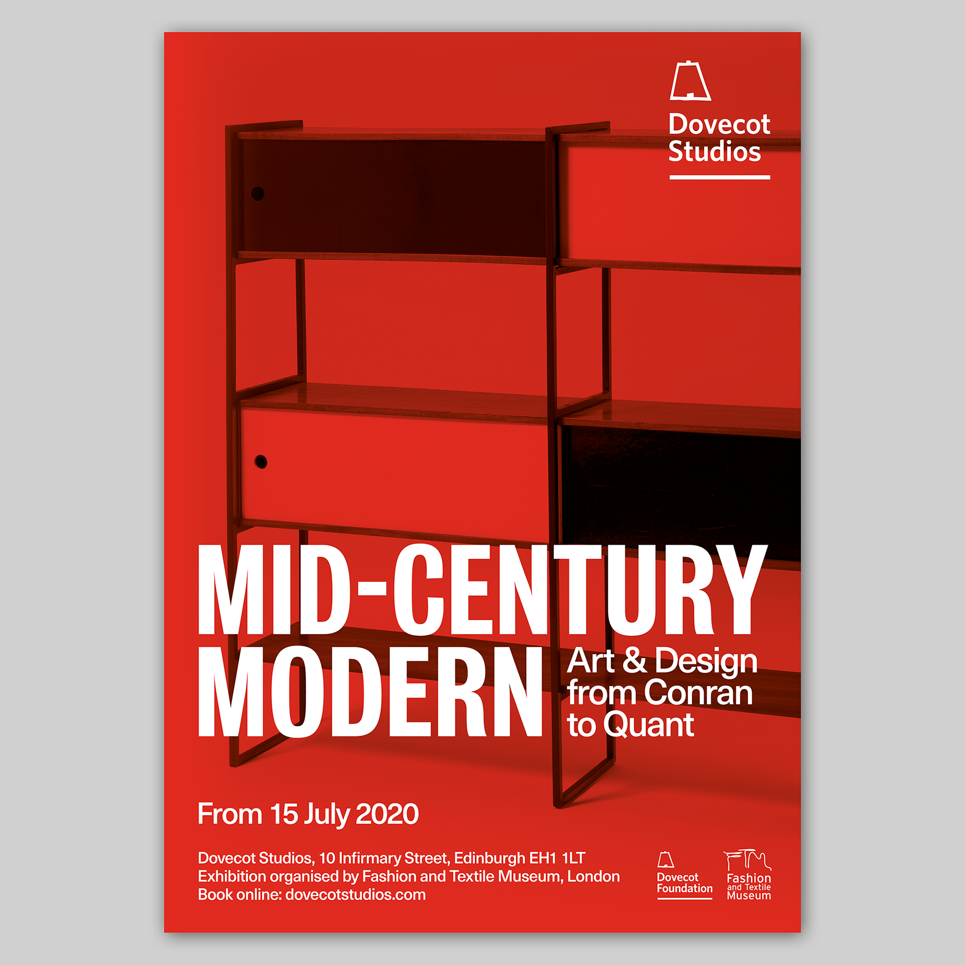
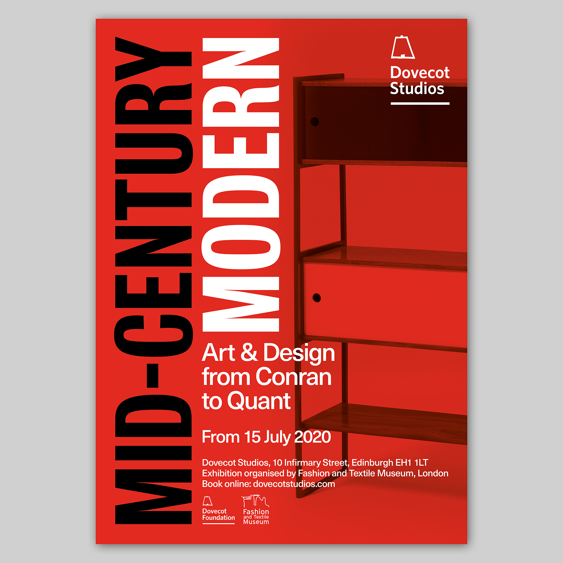
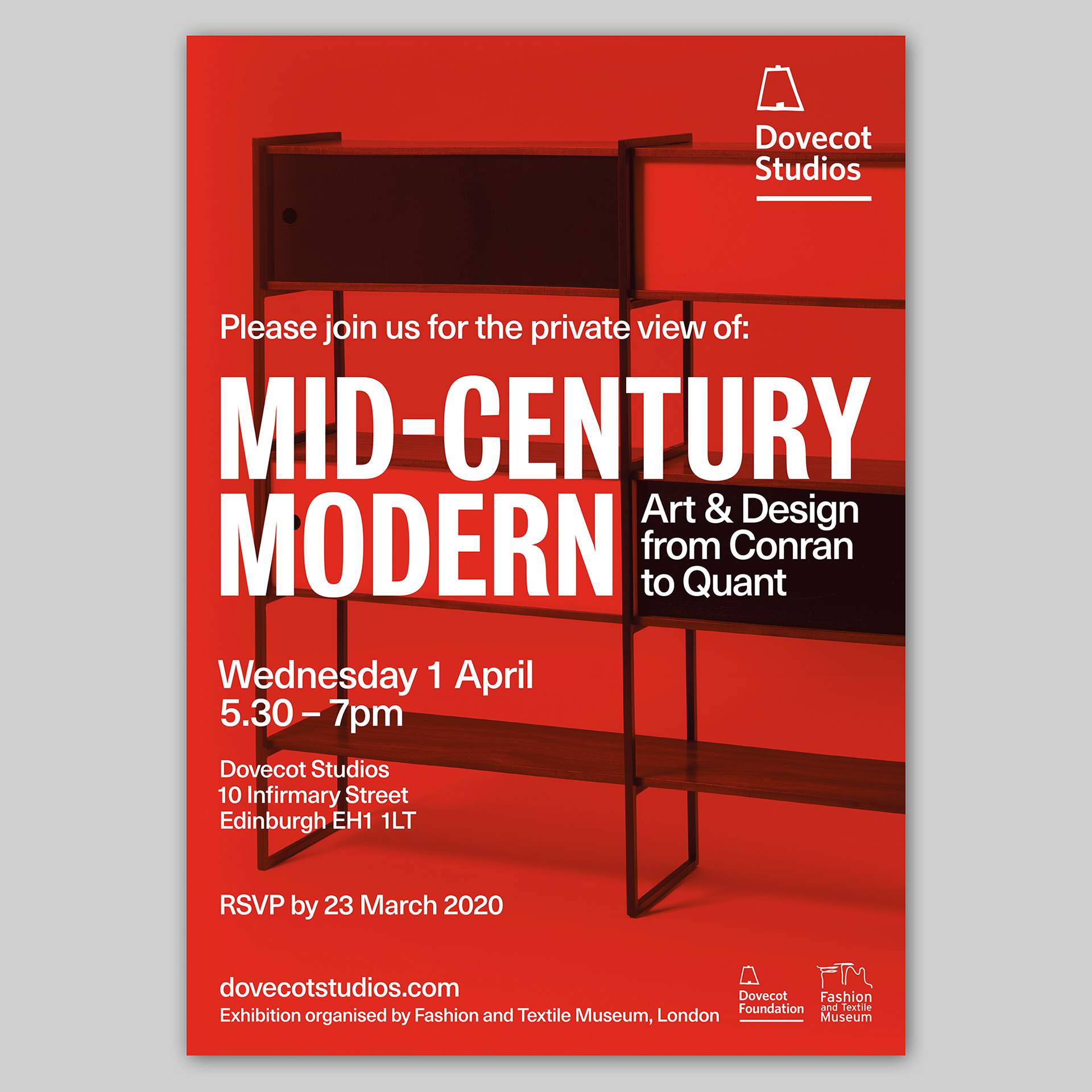
Dovecot supplied a set of images of objects from the exhibition which I converted to grayscale, then placed behind a transparent red, creating a striking contrast with the predominantly white type. I presented versions with different images, but the image favoured by the team at Dovecot was of this shelving unit designed by Terence Conran. I designed two alternative treatments for the type: one with the text arranged vertically, much like the type on the cover of the book, and one with a horizontal arrangement. The team liked both versions and each treatment was eventually used, with the version above being the lead poster and the one below as an alternative version. In some iterations of the design, the type is used without the image.
The book cover informed the choice of typefaces used on the marketing material as well as the colour palette of red, white and black. For my designs, the exhibition title is typeset in Bureau Grot Condensed with a customised, shortened hyphen and the remaining copy set in Neue Haas Unica: both typefaces were designed later than the focus of the exhibition, but their roots are much earlier, so are fitting for an exhibition of swinging sixties modernism (Unica was originally released in 1980 but was based on two earlier typefaces: Univers, which was originally released in 1957; and Helvetica, a typeface that is one of the hallmarks of the International Typographic Style that emerged from the work of Swiss designers in the 1950s and 60s. The sans-serif Bureau Grot was developed in 1989 and is based on grotesque typefaces from the nineteenth-century that I believe were often used by designers in the sixties as a substitute for Helvetica, which was less widely available at that time).
Dovecot supplied a set of images of objects from the exhibition which I converted to grayscale, then placed behind a transparent red, creating a striking contrast with the predominantly white type. I presented versions with different images, but the image favoured by the team at Dovecot was of this shelving unit designed by Terence Conran. I designed two alternative treatments for the type: one with the text arranged vertically, much like the type on the cover of the book, and one with a horizontal arrangement. The team liked both versions and each treatment was eventually used, with the version above being the lead poster and the one below as an alternative version. In some iterations of the design, the type is used without the image.
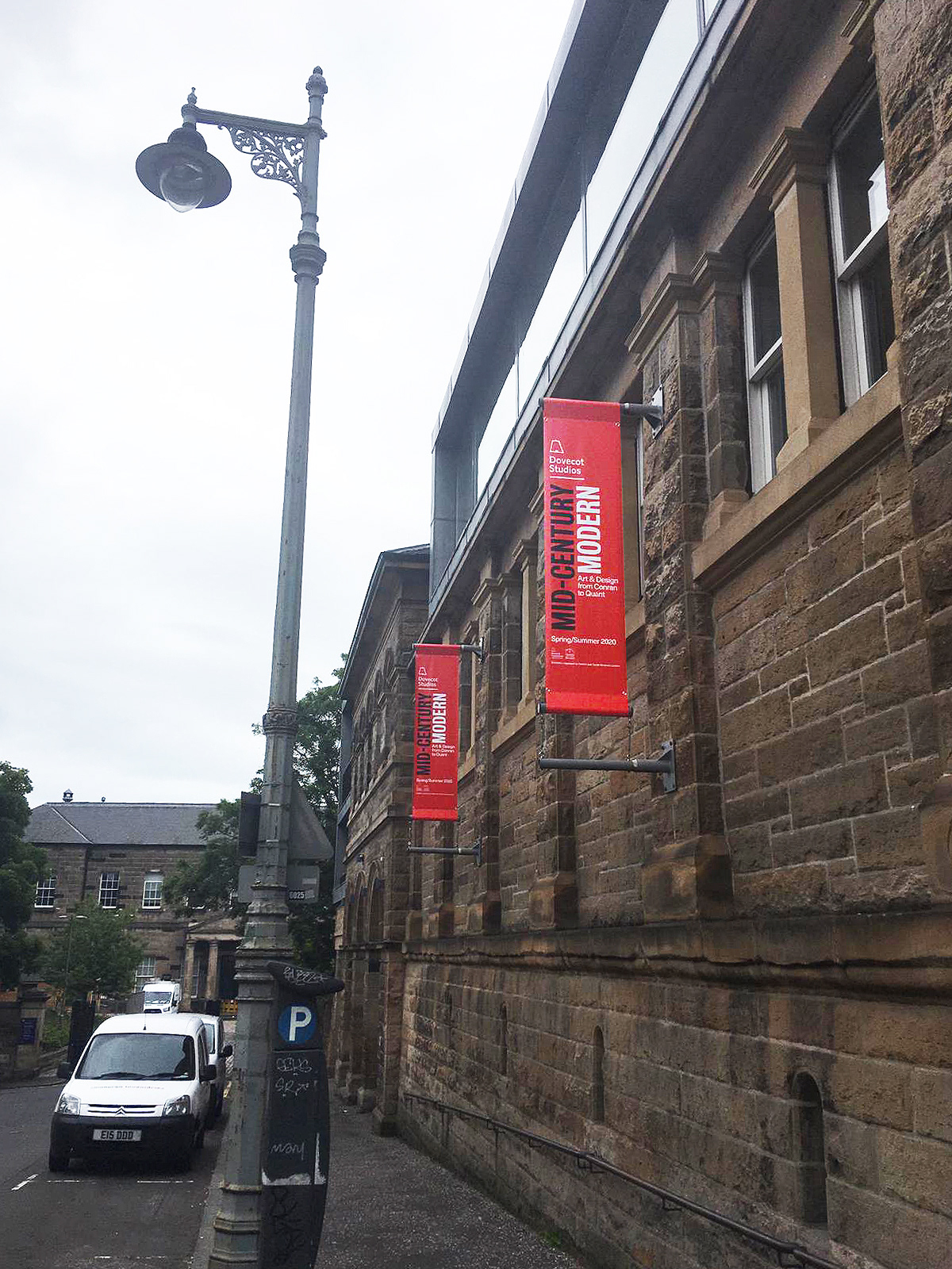
The identity was designed to be adaptable and once the identity for the posters was established, it was then developed to appear on designs for banners, which are displayed both in and outside of the Dovecot building, and in various forms on the Dovecot website. Below are two versions of the identity in use on the website and at the bottom is an email footer used by Dovecot staff.
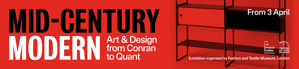
Below is the poster and banner in Dovecot:
In addition, I also designed an invitation to the private view (below) and a printed flyer to promote events around the exhibition – the front of the flyer is the same design as the poster, the image at the bottom is the reverse of the flyer.
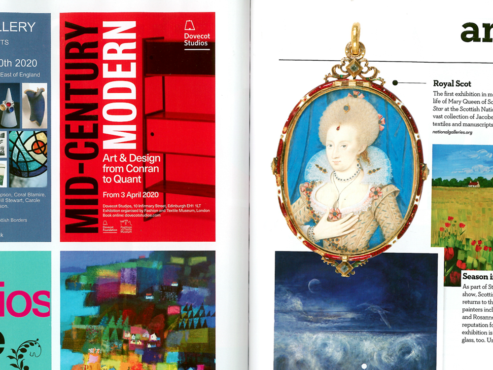
Below is an advert for Mid-Century Modern: Art & Design from Conran to Quant in the March/April 2020 issue of Homes and Interiors Scotland:
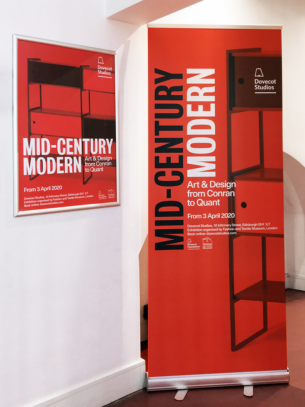
Below are the banners outside Dovecot Studio in Infirmary Street: