Dovecot What’s On Guides
Designed by James Brook for Dovecot Studios, Edinburgh, 2015-18
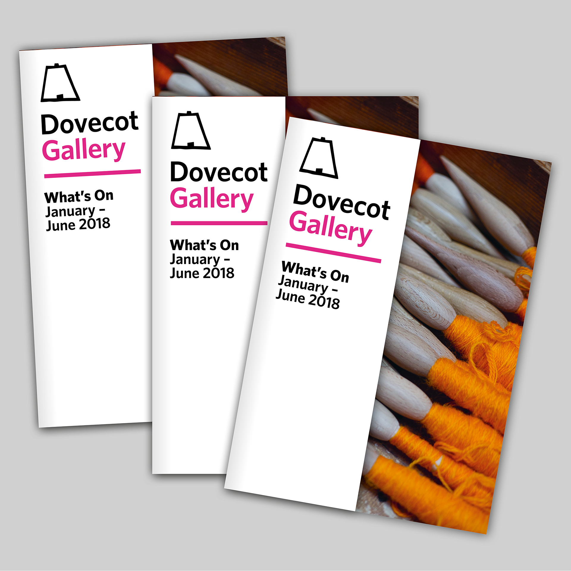
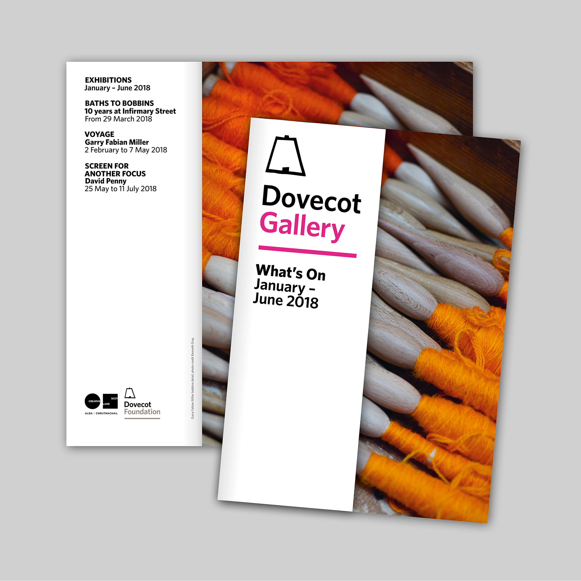
210 x 148 mm | 12 pages with half cover
Printed by Allander, Edinburgh, on Vision Superior
210 x 148 mm | 12 pages with half cover
Printed by Allander, Edinburgh, on Vision Superior
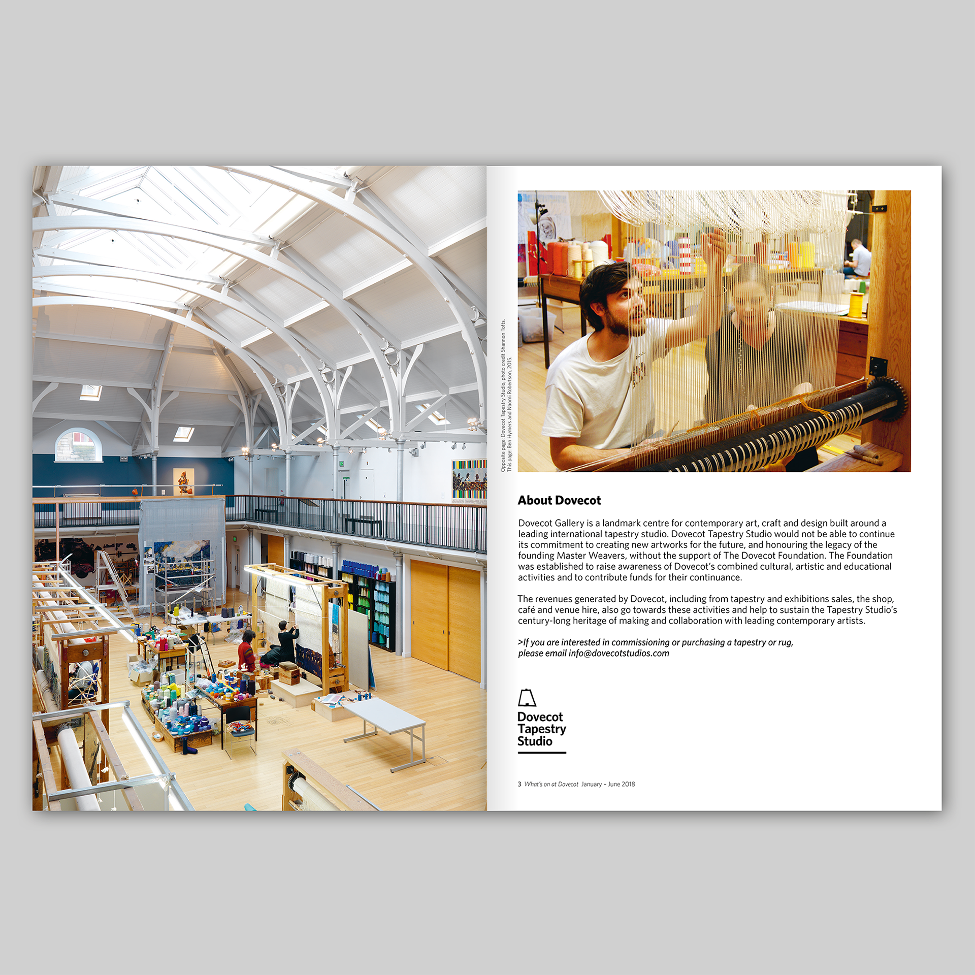
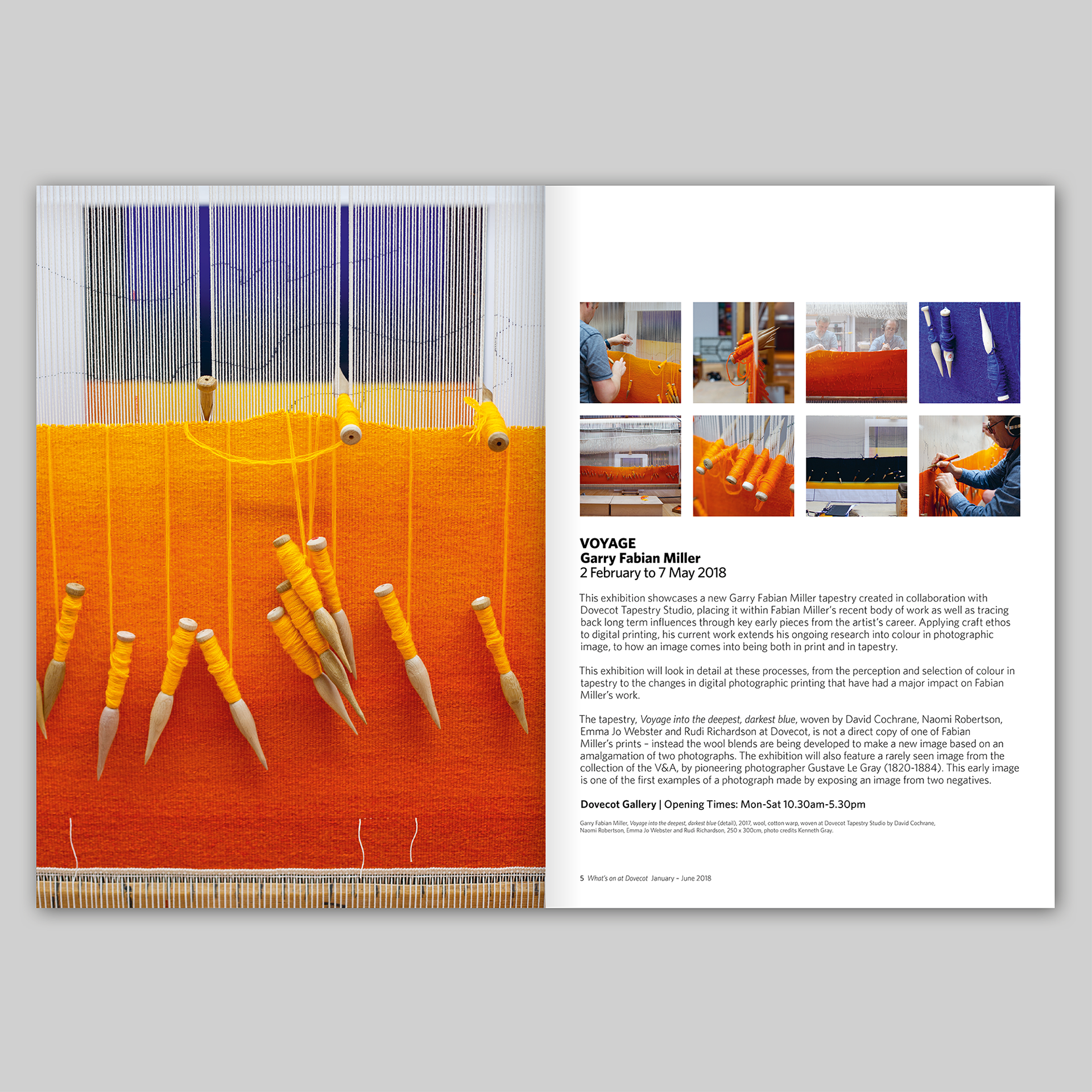
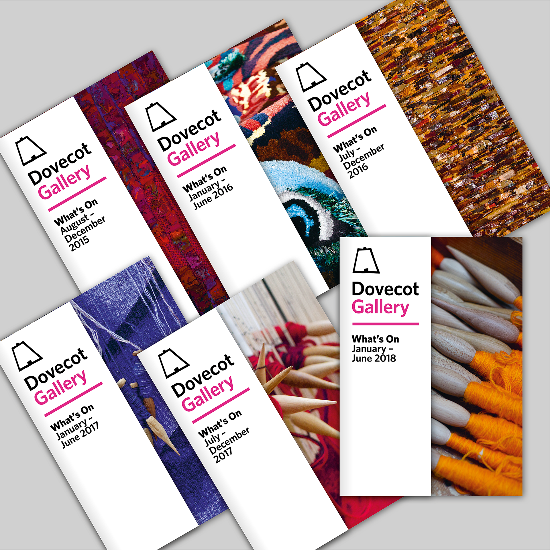
From 2015 to 2018 I designed six issues of Dovecot’s twice yearly What’s On guide. The guide is twelve pages plus cover, which is cut away on the front to reveal half of a full bleed image. A mixture of full-bleed images, half-page images and thumbnails are used throughout in contrast with pages of simple, pared back typography in black, grey and Dovecot Pink, printed on the clean white of Vision Superior, an uncoated paper that has a pleasant tactility. The format and template remained consistent through all six issues but was always tweaked to accommodate new types of information, and to keep it looking fresh whilst still retaining the look and feel of the first edition.
The ideas that informed the design of the guide were applied to other items that I designed for Dovecot – posters, invitations, banners, advertisements – and this consistency of design, with liberal use of white space and prioritising of imagery combined with considered and rational typography created a distinct and identifiable brand for Dovecot, firmly positioning the gallery on the contemporary art and design radar.
Below are spreads from the sixth issue of the guide, designed for Dovecot in 2018. After this issue, Dovecot asked me to re-format the guide as an A3 leaflet folded to A5. This new format was intended to concentrate on the numerous events that Dovecot promote.