Manipulate Festival Identity
From 2023-2025 I designed three identities for Manipulate, Edinburgh’s international festival of visual theatre and animated film. The festival presents the very best of Scottish and international visual theatre, puppetry and animated film to audiences across Edinburgh and beyond.
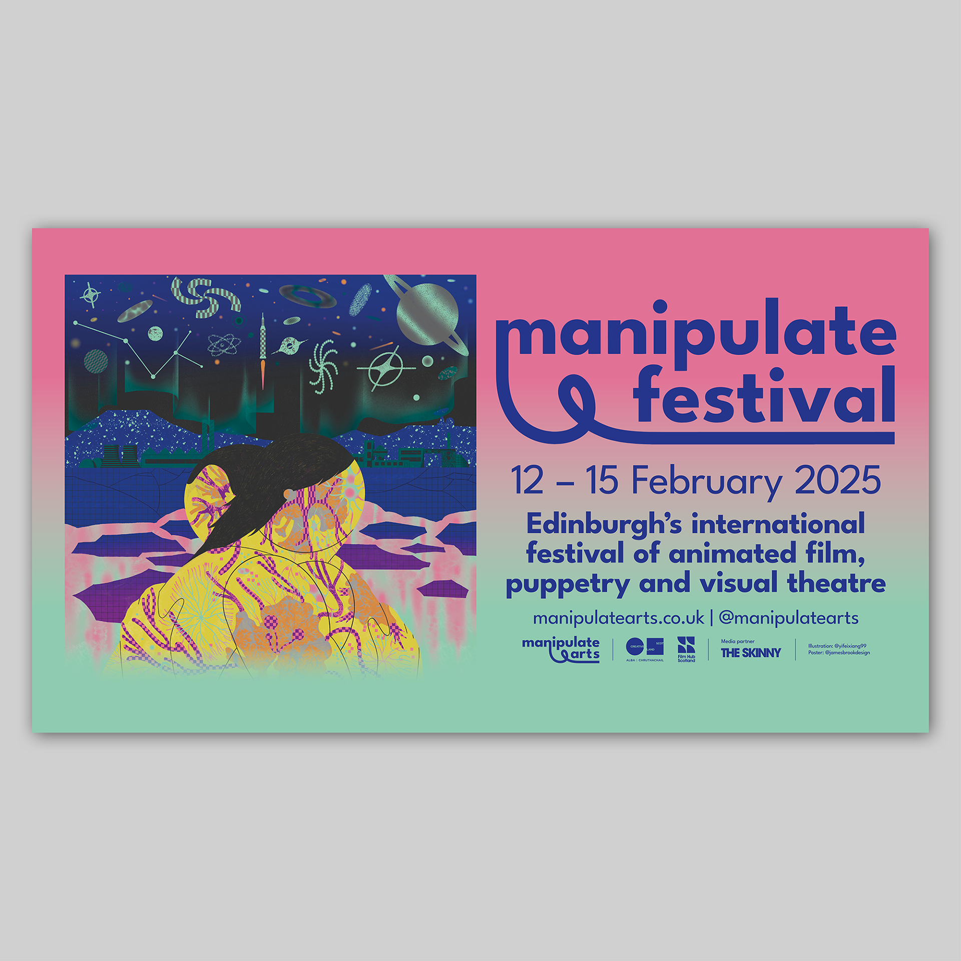
Each iteration of the identity began with the design of an A1 poster that was then adapted for the other marketing items that were needed. For the first two years, I designed several individual posters to promote different performances and events during the festival, plus a general poster – these posters featured photographic imagery from each performance against a background and layout that I designed, creating a cohesive and instantly recognisable set of posters. For the 2025 iteration, I worked closely with an illustrator, Yifei Xiang, to produce a single poster design with a key ‘hero’ image to represent the festival.
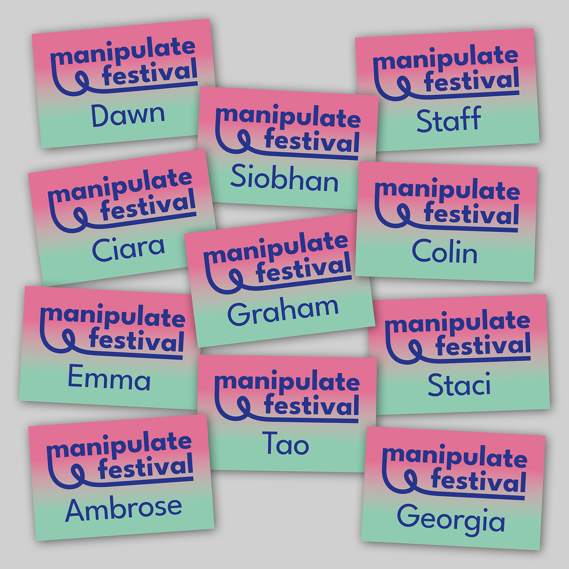
In all three iterations of the identity, the layout and design of the A1 poster – once finalised with the Manipulate team – was used as a starting point for the design of other marketing material including: posters of various sizes from A3 to A0; a programme guide; online and printed advertisements; social media assets; digital posters; staff lanyards; and a ‘takeover’ of The Skinny website.
Above is the A1 poster that I designed for the 2025 edition of the Manipulate festival with an illustration by Yifei Xiang.
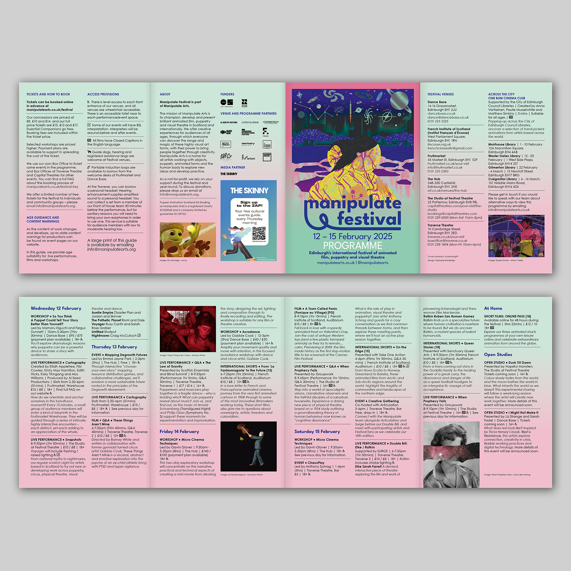
Below is the printed programme guide, a digital poster, and staff lanyards, showing how the design of the poster was adapted to create a cohesive suite of assets for the festival.
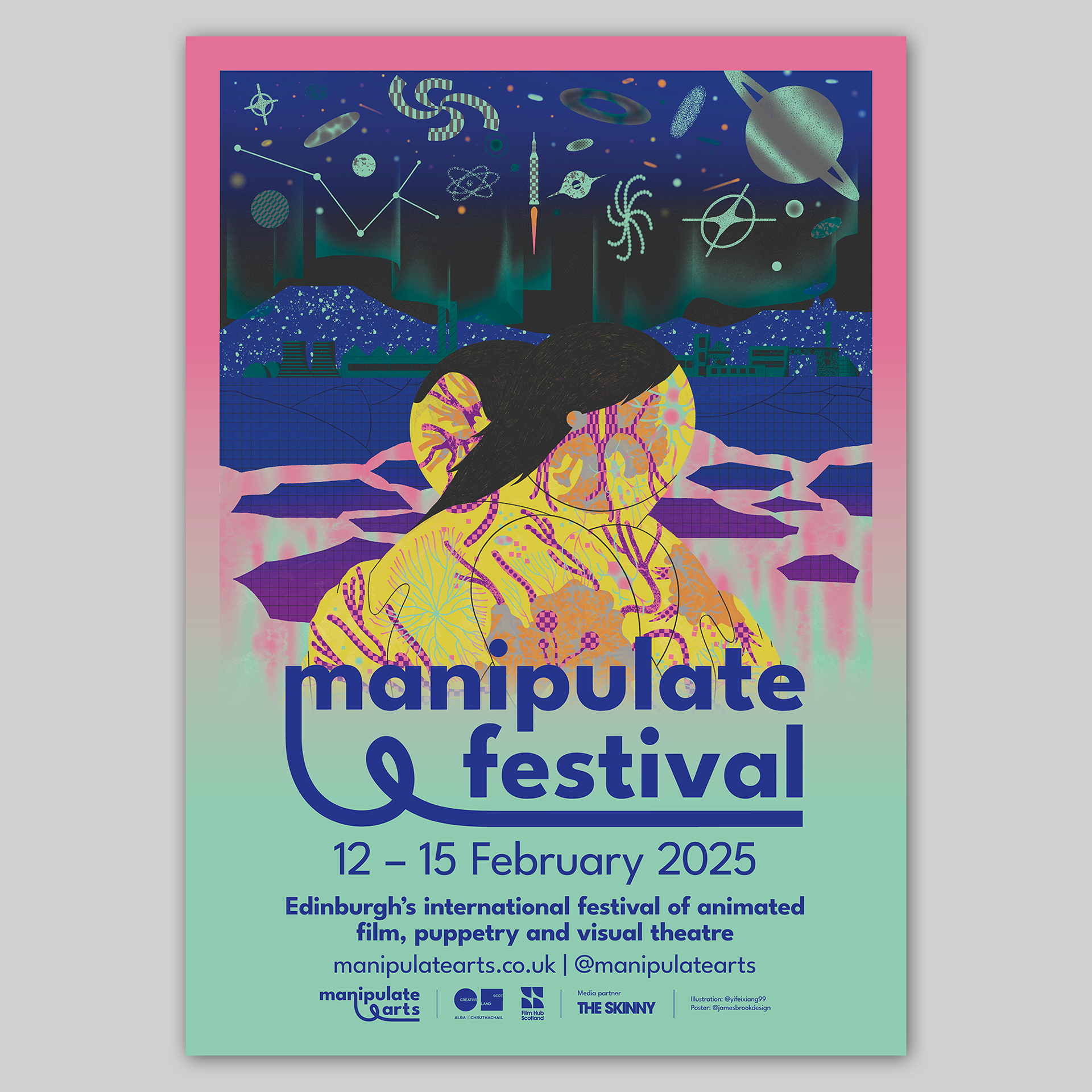
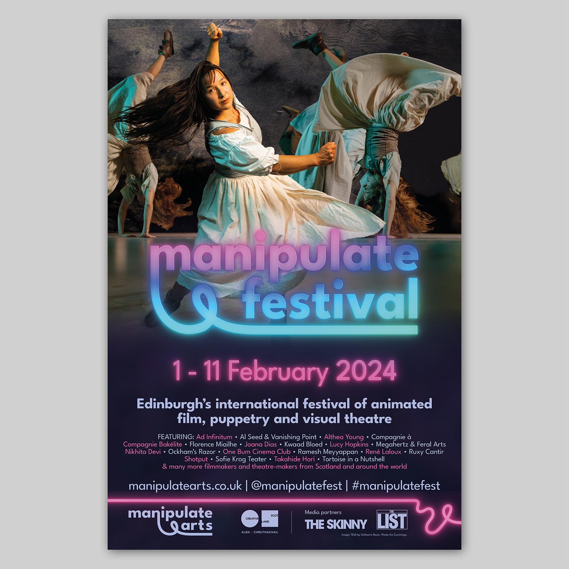
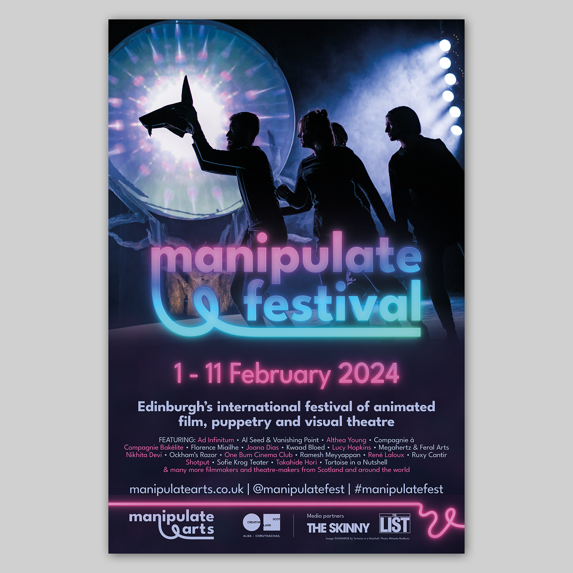
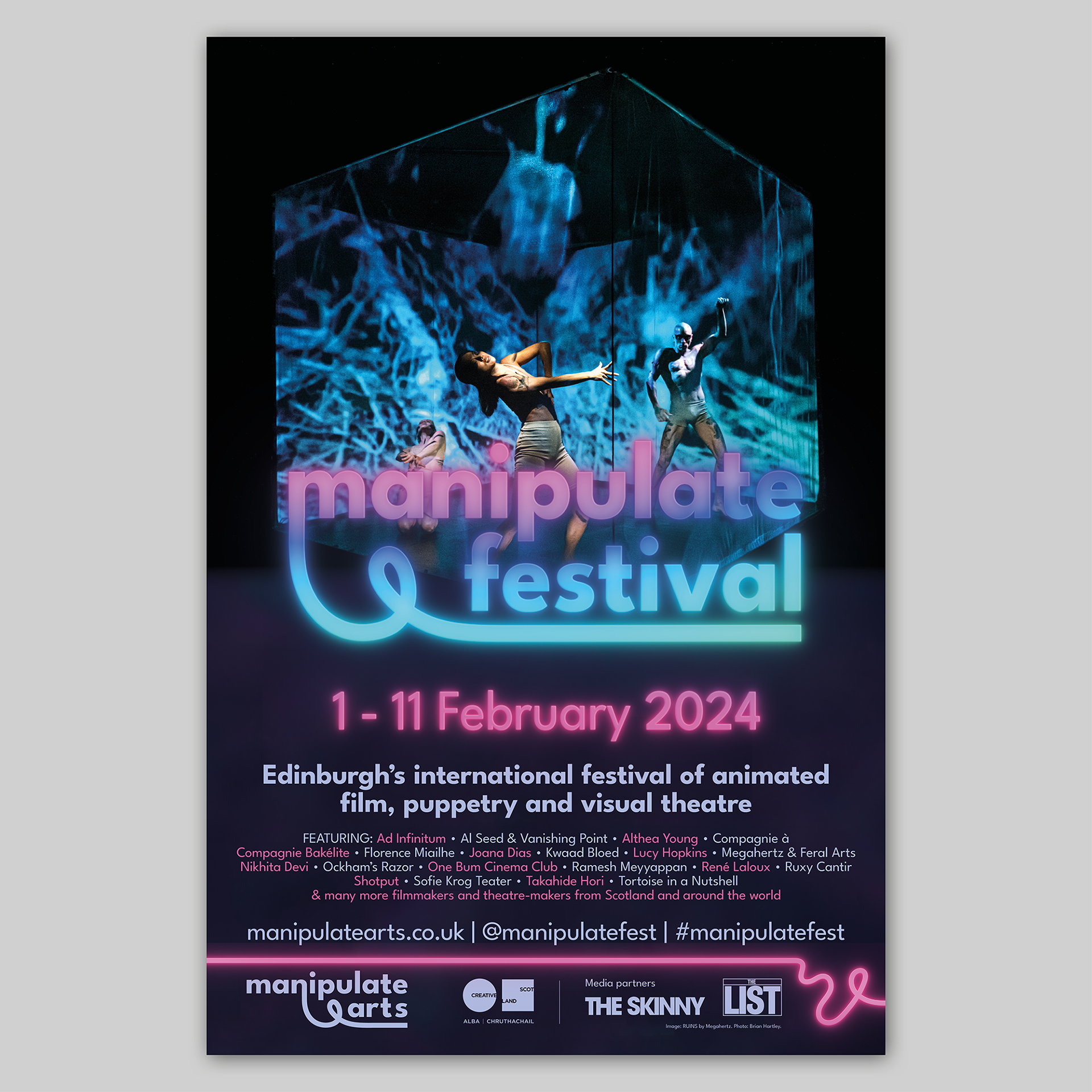
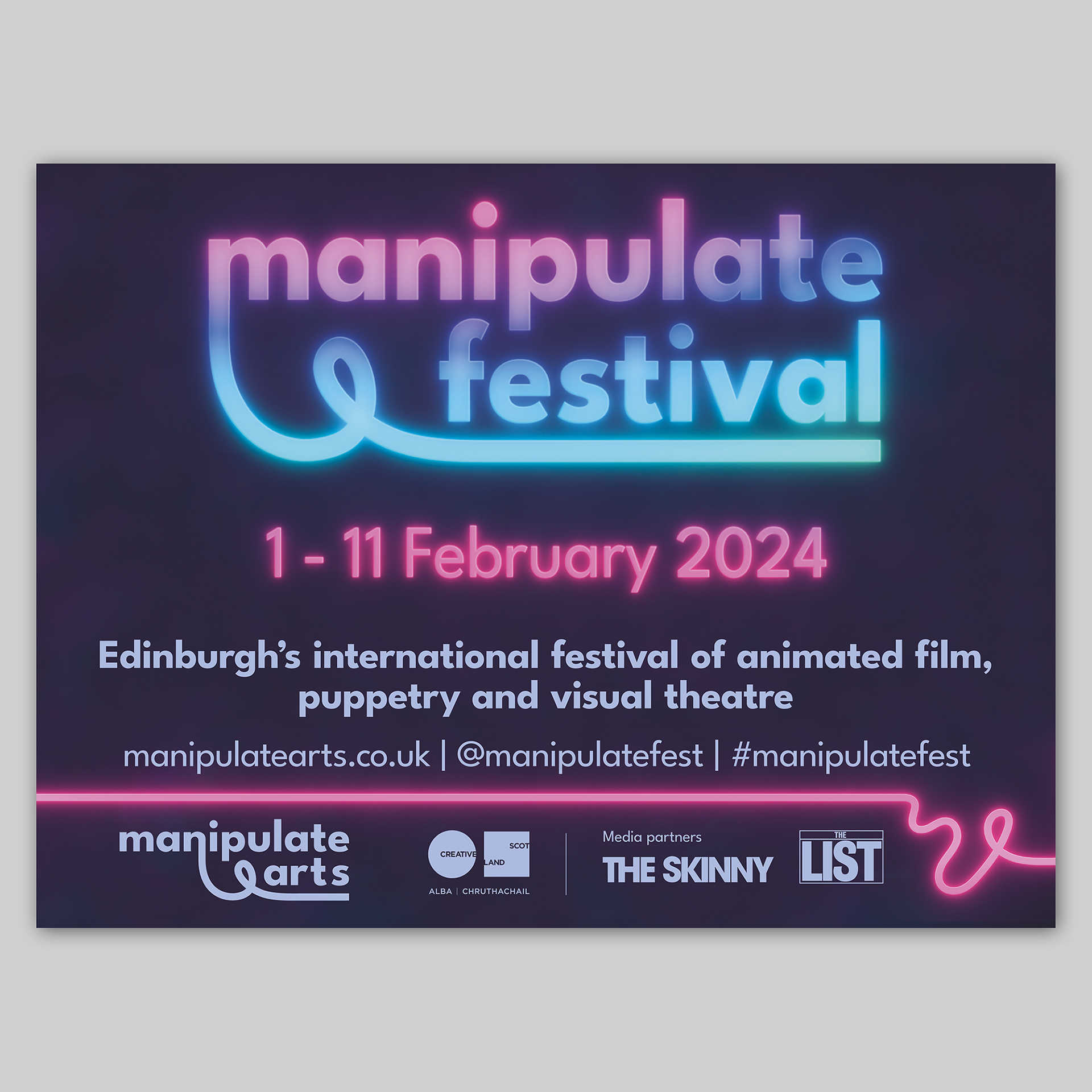
Below are the A1 posters that I designed for the 2024 edition of the festival.
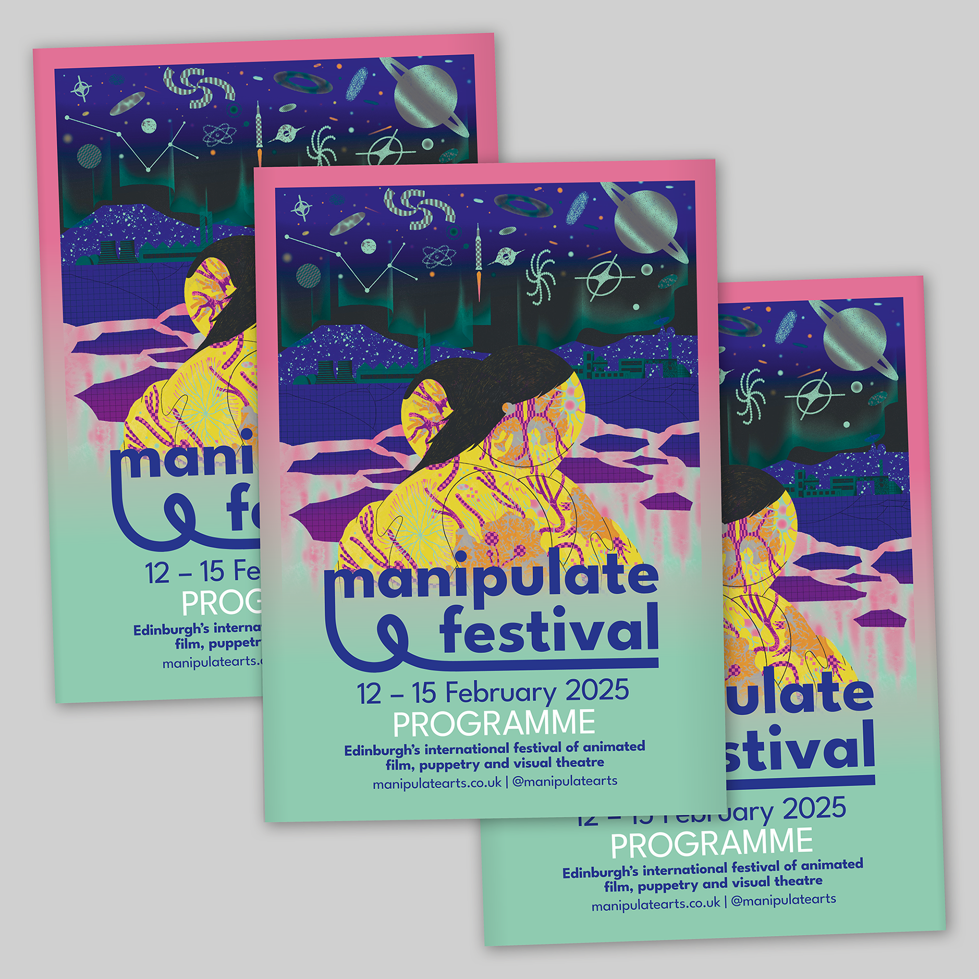
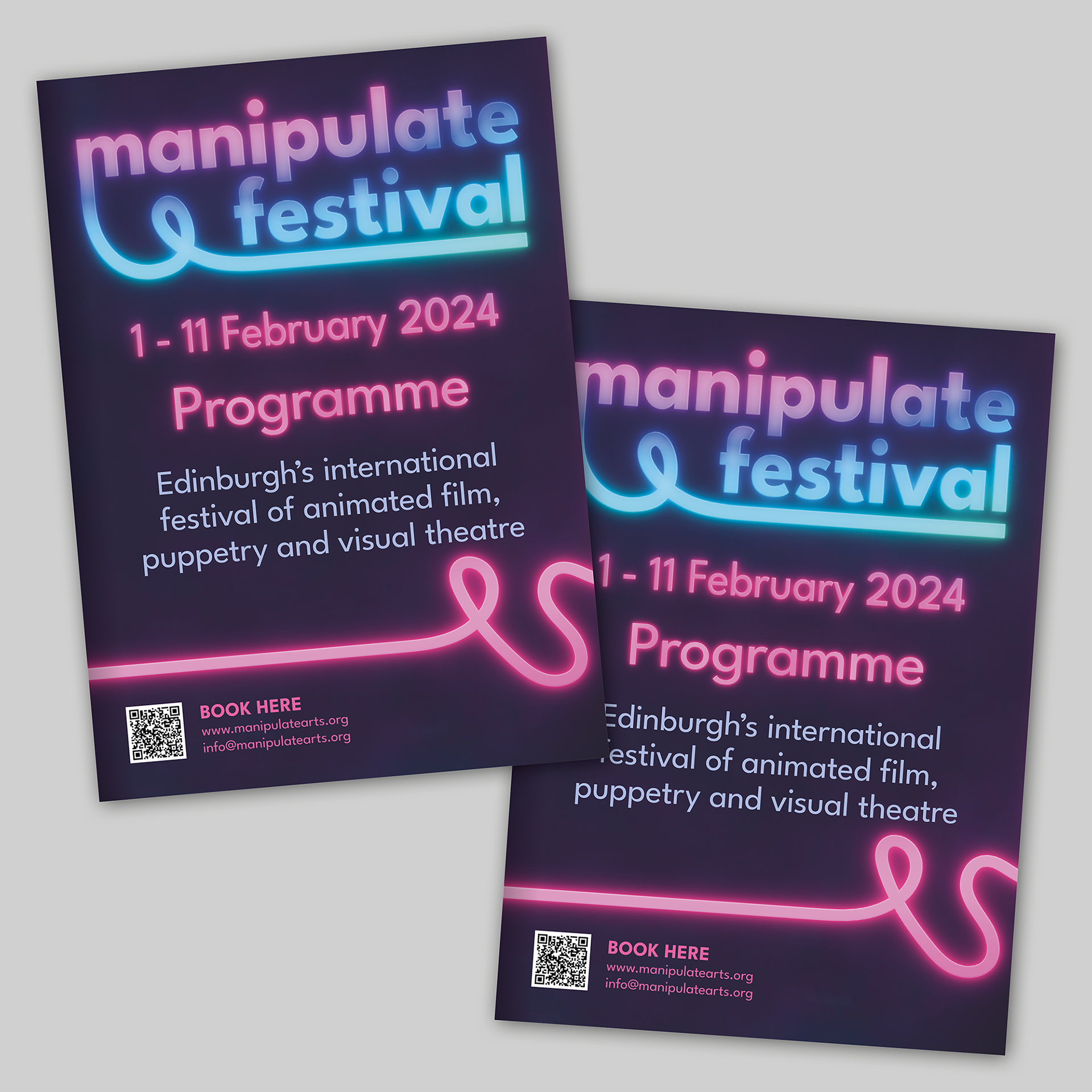
Below is the printed A5 programme guide.
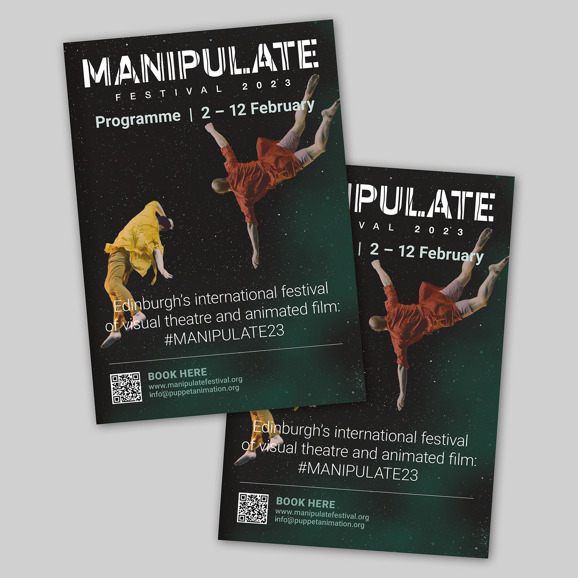
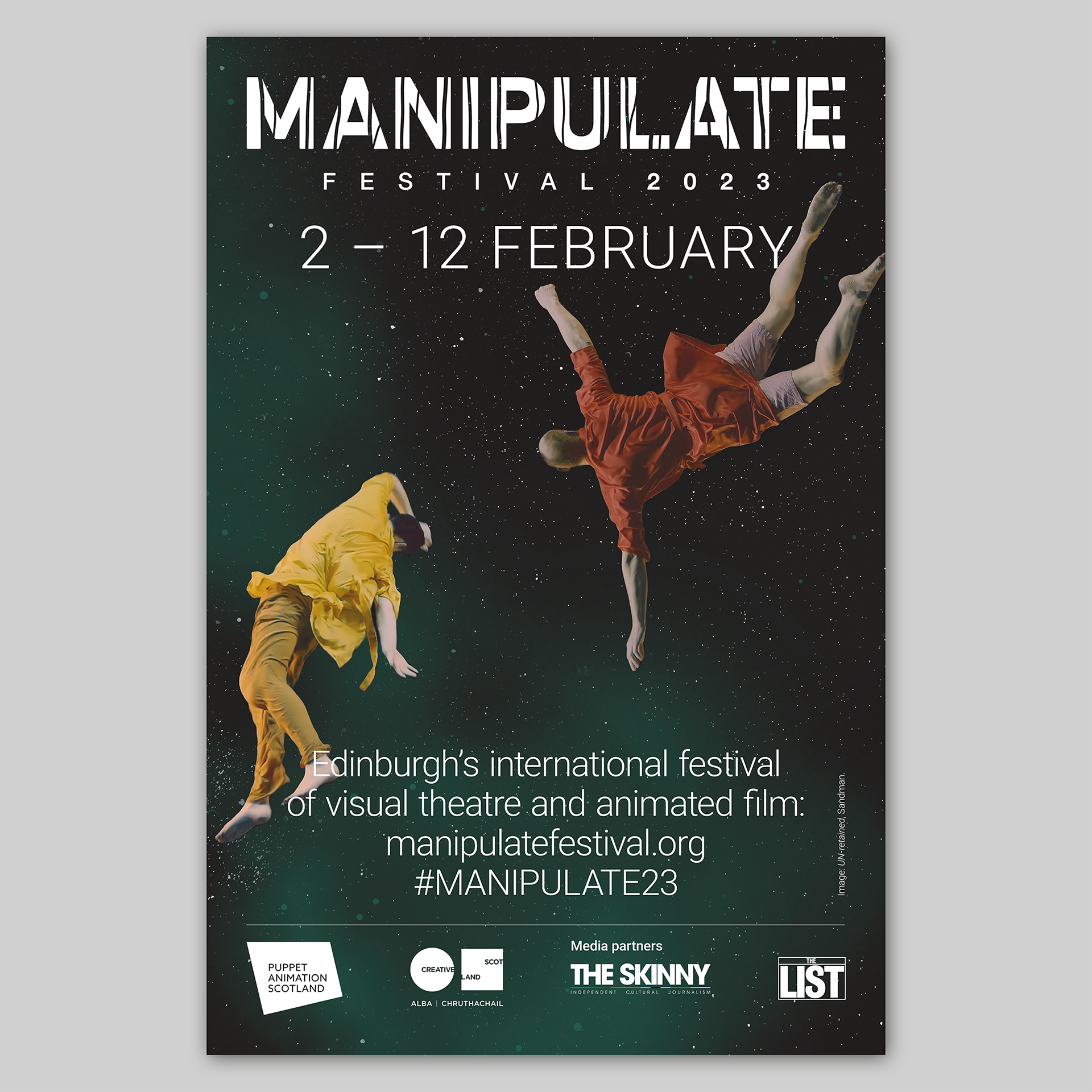
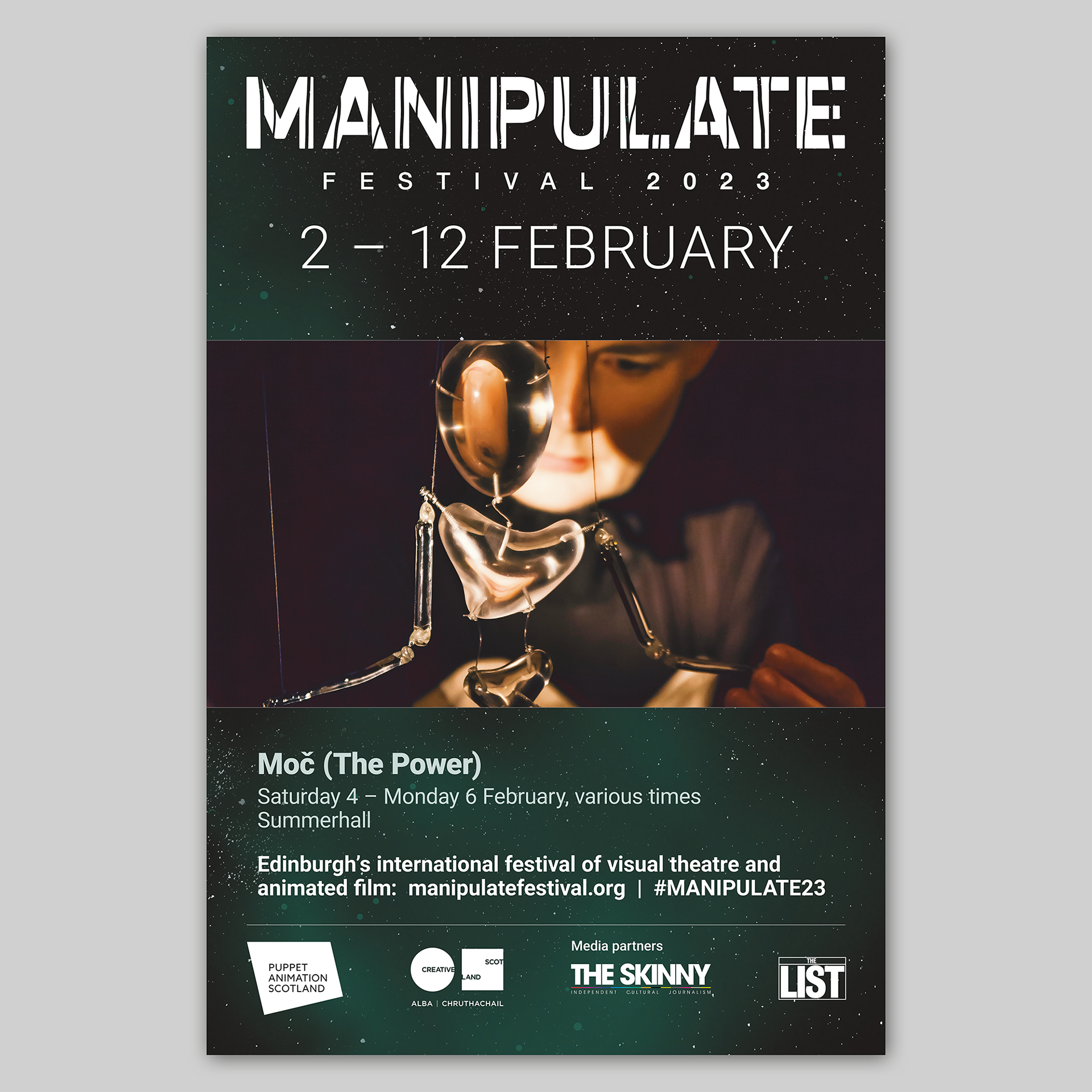
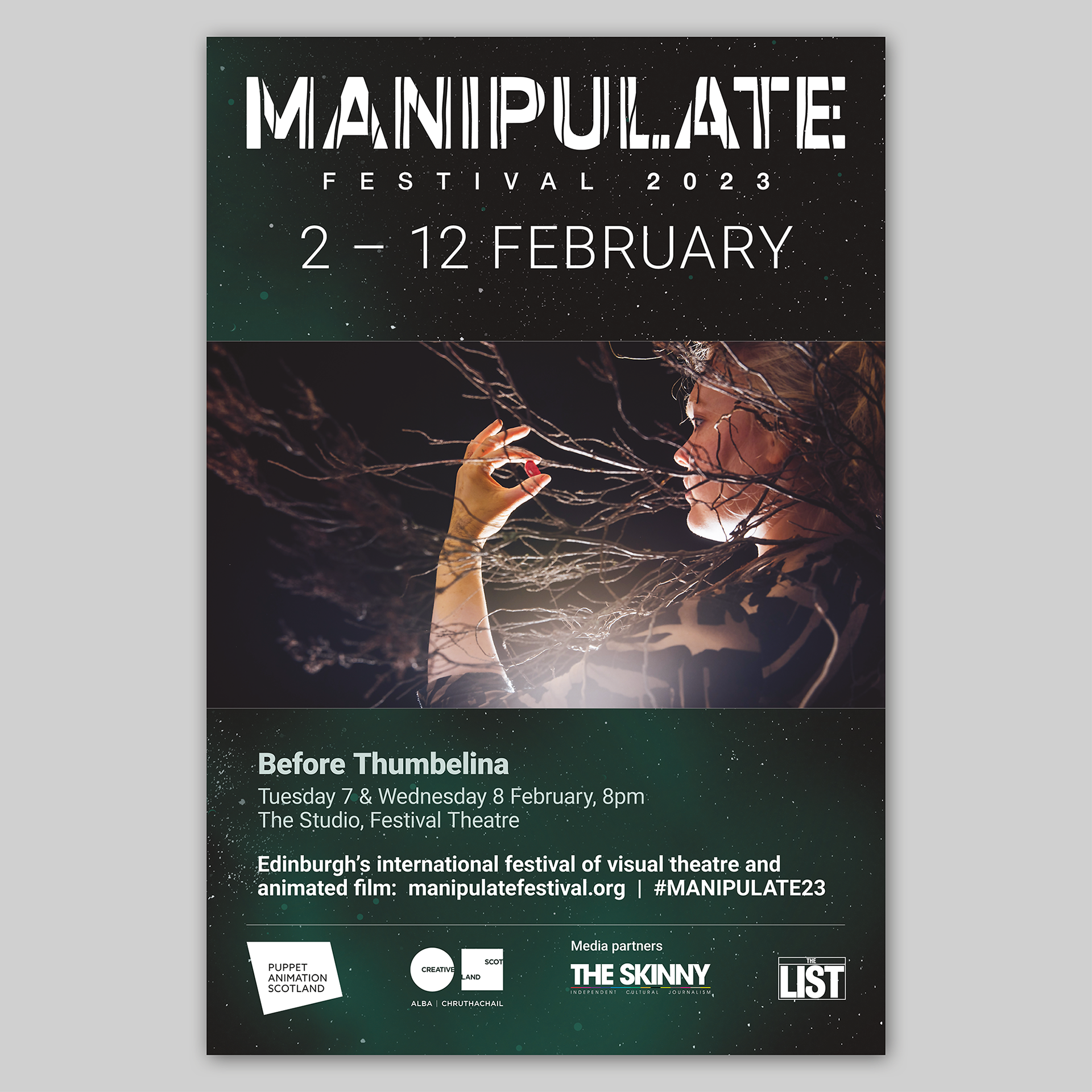
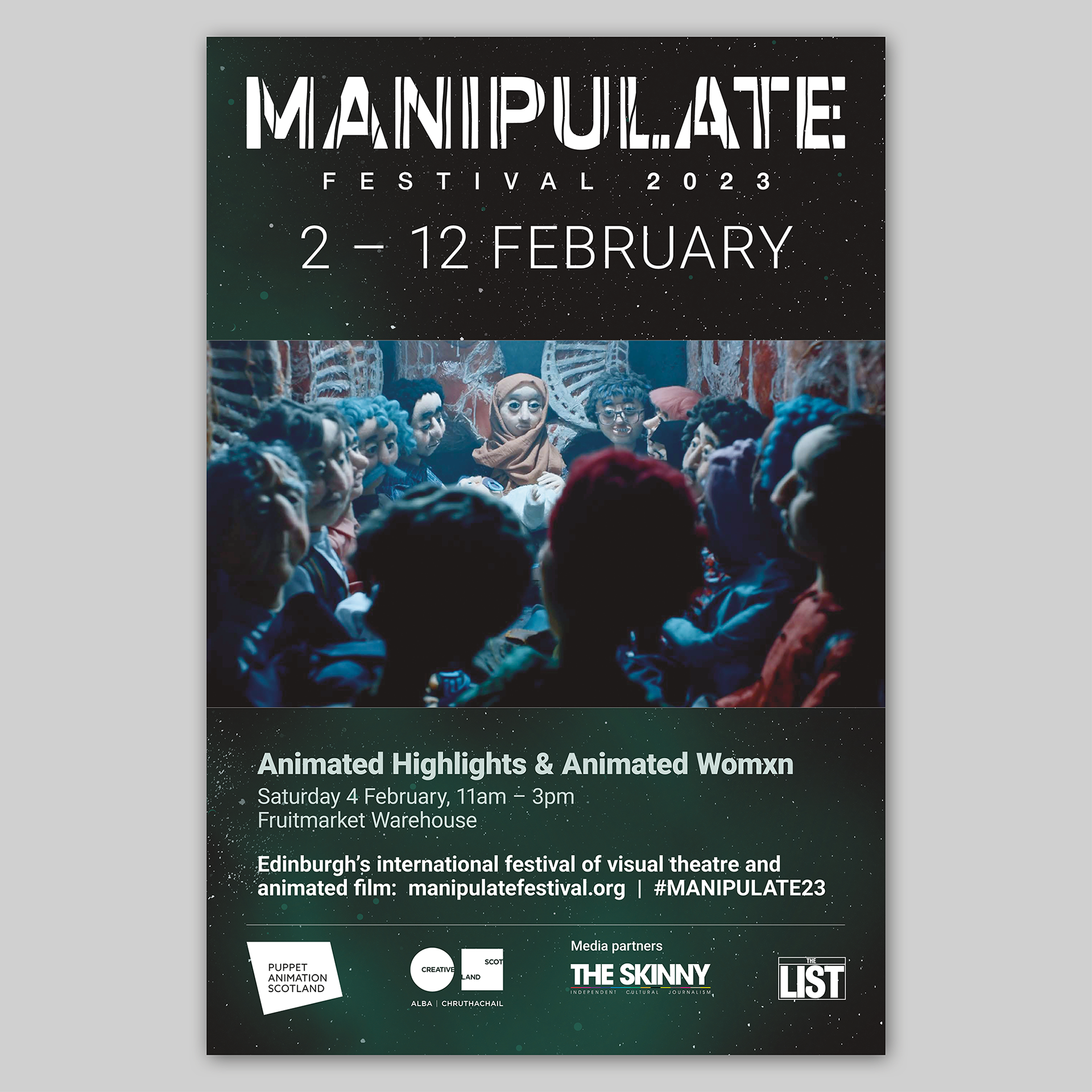
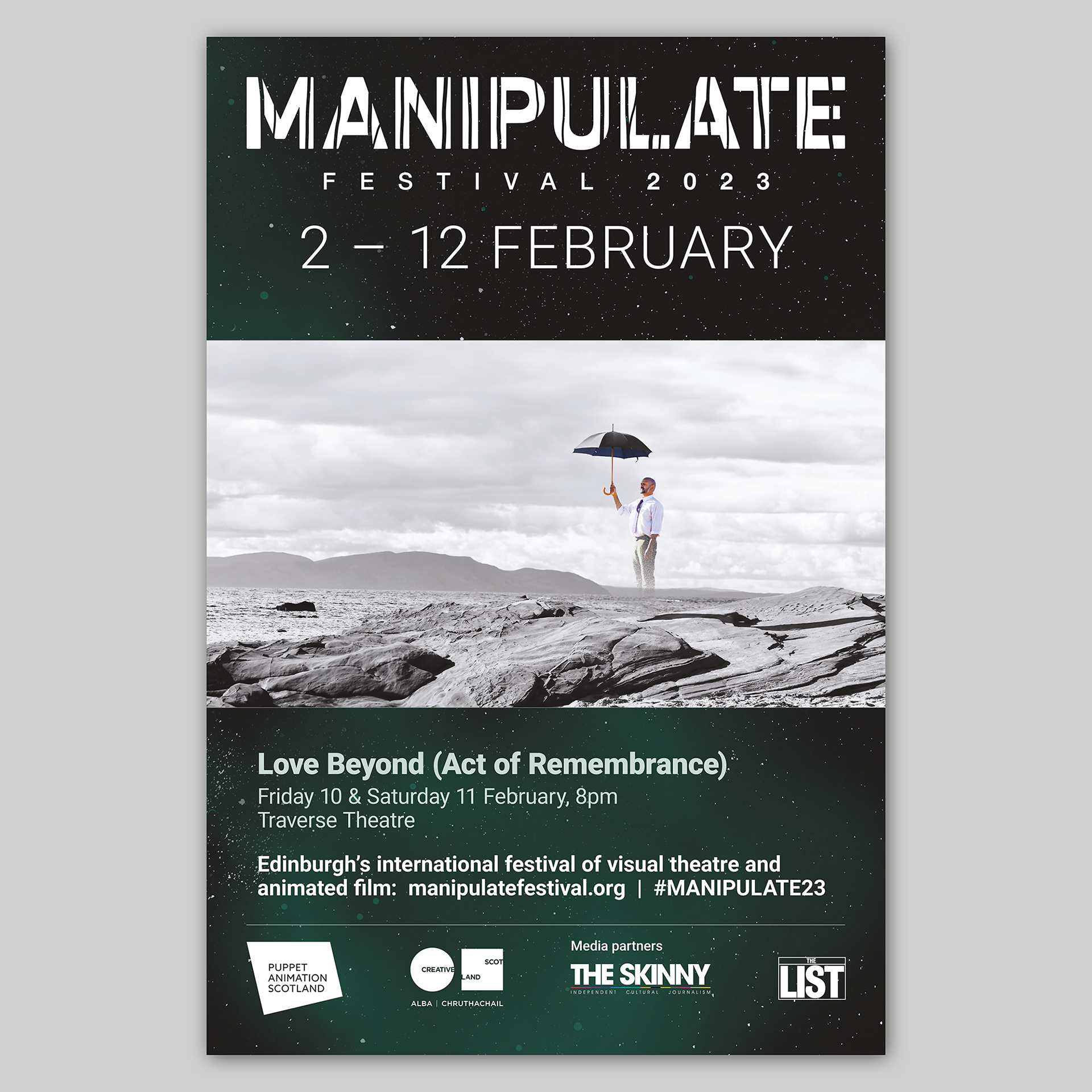
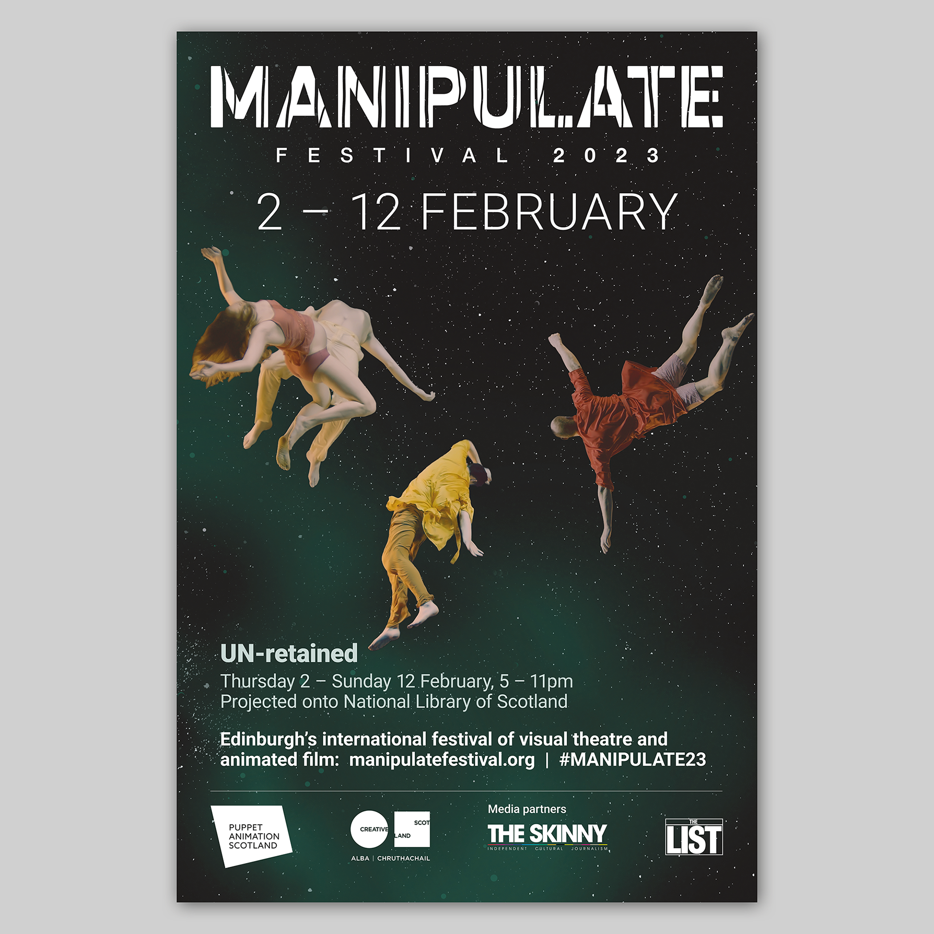
Below are the posters that I designed for the 2023 edition of the festival. The first design is the generic poster that was used as a basis for the other marketing assets that I designed.
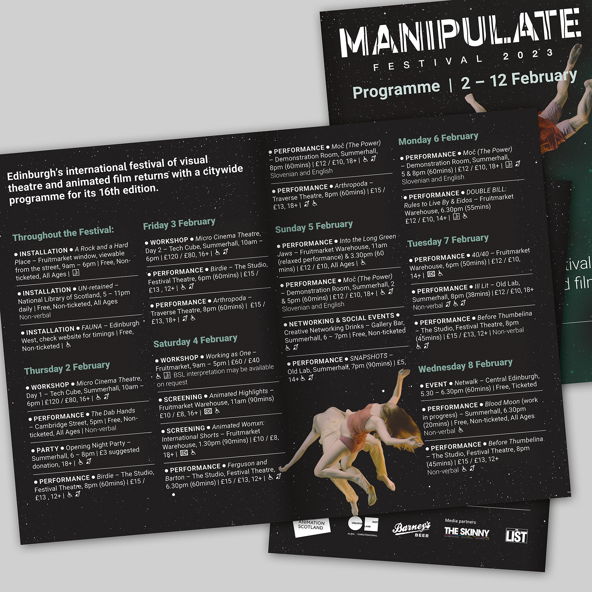
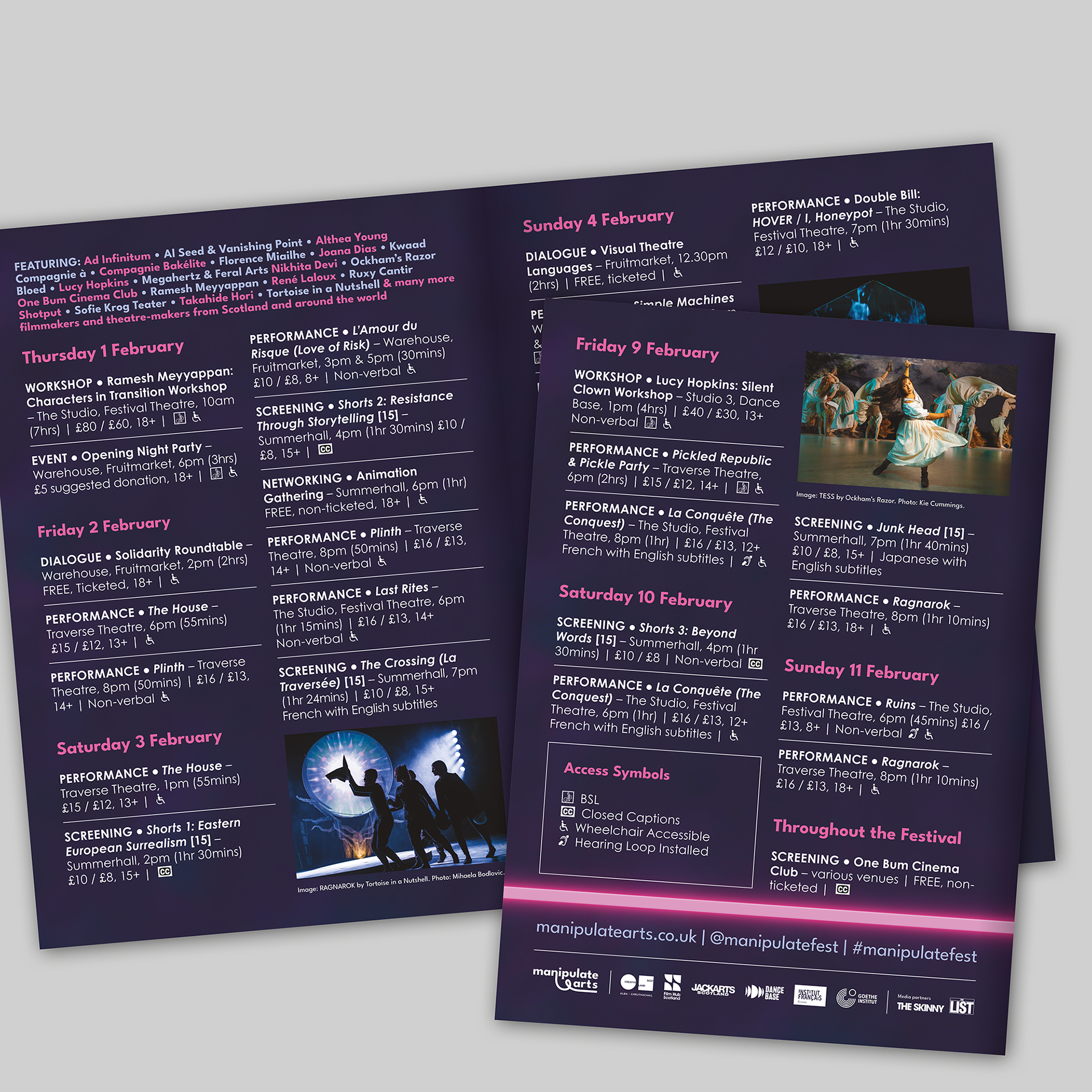
Below is the printed A5 programme guide.